(Originally published in The Pastel Journal)
Massive mountains loom on the horizon, a pale purple-blue backdrop to the hills and fields before them. Although they’re still thirty miles away, the jagged peaks are vividly etched against the soft blue sky. Shadows flow across the slopes, defining the repeated folds, a ray of light picking out the blue-green of a distant hillside. Mountains define the western skyline, rising from the high plains to altitudes so high that the uppermost reaches can be decorated with snow year-round. These giants set the stage for the drama of the West.
Mountains can pose some unique challenges to the artist. Doing a complete study so that you come to better understand the unique aspects of these massive ranges allows you to resolve such issues as scale, form, value and detail. This can be done as a separate sketch or as an underdrawing.
Charcoal underdrawing

The issue of scale is often the toughest to sort out. The inexperienced artist sometimes decides that in order to show the massive mountains she should try to fill the entire picture plane with nothing else. Mountains crowd the scene, with very little sky or foreground, but become oddly dwarfed by the context, or the lack of context, of the painting. Instead of massive crags, these appear to be mere hills. This is in part because surrounding elements serve to show the grandeur of the peaks. In a framework of sky and foreground, relative scale becomes apparent. Without elements to compare to the mountains, the viewer has no grasp of their size and will often assume they’re far smaller. Including clouds above or trees and grass in front, or both, gives the viewer a comparison by which to grasp the scale.
It’s best to have a good understanding of the form of the mountains you’re painting. Form, of course, is the three-dimensionality of an item. It shows depth, as well as height and length, making a triangle into a pyramid. In the case of mountains, the ways that peaks and valleys interplay -- close and far, large and small -- as well as the light and shadow that indicate these factors, add to the form. As you lay out the composition you’ll usually begin to perceive these forms in greater detail.
It’s a good idea to think about how the mountains you’re painting were fashioned over time. In the West, tectonic forces have thrust up the mountains, and continue to do so as continental plates slowly converge and slide atop one another. This seismic shift, which creates some of the largest mountains in the world, often results in a softer slope on the side of the range where the plate has been lifted. These more gradual slopes are gentler and often covered with trees. On the opposite face of the range the edge of the plate is exposed as it has been thrust into the air, creating sheer, sharp outcrops and crumbling rock faces. This exposed edge may reveal striations in many rich and subtle hues of gold, orange, red and purple running along the course of the range. Look for those places where a particular kind and color of rock takes up farther along the chain, repeated at similar altitudes, though often angled downward from the axis of the break.
Mountains are subject to the erosion caused by wind and rain, which wears away softer types of rock, leaving harder rock exposed. The granite faces of Pike’s Peak in Colorado have outlasted surrounding rocks unable to withstand eons of erosion. Often granite can take on a particular pinkish color, giving a fiery glow to mountains such as the Sangre de Christo (Blood of Christ) range in New Mexico, named for the almost blood red color these peaks become at sunset.
Dry and Cool, 12” x 18”
Occasionally an area of the earth’s crust will be thrust up into a large dome shape but because the seismic forces are somewhat less severe the crust does not crack and split apart. This results in softer rolling ranges such as the Black Hills of South Dakota, which can include extremely colorful rock layers that remain at remarkably similar altitudes. Again, look for ridges of rock linking neighboring mountains with their stripes of color.
Sometimes as the huge blocks of the earth's crust are tilted upward or are completely turned over by tectonic shifts, they push up along a fracture line or fault, resulting in ranges such as the Sierra Nevada in California. These chains have piles of loose rock deposited at the base by the scraping motion of the movement that created them, and often have a rough, jagged line of peaks, such as those characteristic of the Grand Tetons in Wyoming, or other areas where spectacular rock outcroppings occur.
When you paint recognizable mountain ranges -- those that have identifiable shapes such as the bold geometry of Half Dome or the Tetons’ toothy skyline -- it’s best to include characteristic natural elements and indigenous vegetation in the foreground. In other words, don’t put a saguaro cactus into the high regions of the Tetons, no matter how much you need a vertical element.
Often when the artist begins a detailed underdrawing of the peaks and valleys found in a mountain range she finds that she cannot tell what lies in front or behind, whether the mountainside continues to descend or begins to rise in one particular place. Rather than becoming blocked by this, unable to go on with the drawing, she must take matters into her own hands and simply decide. Unless you’re painting an extremely detailed exploration of every peak, no one but mountain climbers will argue with you. However, when you’re painting an identifiable and familiar mountain chain, be sure to conform relatively closely to the specific shapes and spacing of the crests.
South View, Placitas, 18x24”
Due to the effects of aerial perspective, certain elements begin to change as mountains recede toward the horizon. First, and most noticeable, everything becomes cooler in color and lighter in value. The intensity of warm colors fades. Detail is slowly lost, edges soften and the contrast in value diminishes. In his book Carlson’s Guide to Landscape Painting, written in 1929, respected art instructor John Carlson explains that as one looks sideways through the progressively thickening atmosphere it’s as though there were curtains of air hanging at regular intervals, like veils through which you see. Another way to picture this is to think of one-square-mile blocks of slightly bluish air stacked sideways and upward, filling the distance. The farther away an object is, the more blocks you must look through and the paler and bluer things become, until the most distant range of giant mountains is reduced to a mere line that’s nearly sky blue. Leonardo da Vinci, the consummate eyewitness of physical effects, noted this bluing of objects with increased distance. In the 1500s he observed that if an object “is to be five times as distant, make it five times bluer.” His advice still applies today. The only exception to this visual rule is white. In the distance white becomes slightly dull and warm, a pale pink or yellow. Distant snow isn’t the same bright white as that in the foreground. Clouds atop far peaks are somewhat yellowed by distance, enhanced by pollution. The values of all colors become paler in the distance. For instance, although you know that the mountains in the distance are made of the same rock, with the same trees, bushes and meadow grasses as those closer to you, the values appear muted and grayer. Test this by squinting your eyes so that the distracting color fades away.
When painting mountains, begin by carefully selecting the proper value for the entire mass, and then delineate the slight differences in value seen in each range, adhering closely to the original value mass unless there’s a great jump in distance. It’s very easy to fall into a little trap when painting mountains. The general value of mountains is medium-dark, which means they’re not as light as the sky or as dark as the trees, and are slightly darker than the medium-light of the ground. However, as you paint downward from the sky, you usually encounter the mountains next, and have no basis to compare values. This means that until you establish the value over the entire piece you cannot adequately decide the correct value of the mountains. They almost always seem to be too dark at first, but are easily lightened in pastels. Additionally, while we generally assign mountains a medium-dark value, this usually refers to the tree-covered lower slopes. In fact, the rocky faces of the high mountains of the west are often a medium value due to the color of the exposed rock, sheer cliff faces and the lack of trees.
No matter what the conditions, whether seen through the warm, hazy light of summer or the still clearness of a cold winter day, whether high and clear or viewed from lower altitudes, mountains form the breathtaking backdrop to so much of the western landscape. You can meet the challenge using careful observation and soon master the colors and values of the irresistibly beautiful mountains.
Silverton Summer, 9x12”
All of the paintings shown are available (subject to prior sale.)

 The issue of scale is often the toughest to sort out. The inexperienced artist sometimes decides that in order to show the massive mountains she should try to fill the entire picture plane with nothing else. Mountains crowd the scene, with very little sky or foreground, but become oddly dwarfed by the context, or the lack of context, of the painting. Instead of massive crags, these appear to be mere hills. This is in part because surrounding elements serve to show the grandeur of the peaks. In a framework of sky and foreground, relative scale becomes apparent. Without elements to compare to the mountains, the viewer has no grasp of their size and will often assume they’re far smaller. Including clouds above or trees and grass in front, or both, gives the viewer a comparison by which to grasp the scale.
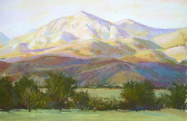


fantastic, made me think in whole new way about mountains, and artistic license
ReplyDeleteAppreciate this lesson on using colors and values when painting mountains. You've really helped me to understand the development of mountains and how to depict these concepts when I'm painting. I'm looking forward to painting mountains with a whole new perspective. Thank you.
ReplyDelete