(With thanks to The Pastel Journal where this was originally published.)
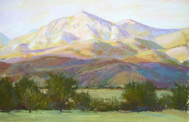
Rocks and Oaks, 9" x 12"
The world is made of rock, the substance beneath our feet. From the top of the highest peak, across the bottom of the ocean, to the quiet expanse of the desert, rock is the underlying foundation of all. In our haste to paint our surroundings we mustn’t neglect rock, yet people seem to think that rocks are difficult to paint. Many times I’ve heard students lament that their rocks look like baked potatoes or soft ice cream. The cure for such problems lies in selecting rocks that are interesting and have sharp light and shadows on them.
Pick up a rock and hold it in your hand for a few moments. Explore the surface, searching for spots that are coarse and uneven, perhaps interrupted by bumps and holes. Now feel for the smoother areas, sliding your finger around a corner. This may be a piece of sandstone that has been smoothed to a velvety sheen by the action of a stream. It could be a piece of quartz, softly polished to a hazy white as it rolled in the surf. Perhaps it’s lava rock with uneven holes all over its surface, or a chunk of pumice so full of air pockets it floats. Your rock may have been blown by wind, sandblasted to a soft roundness or broken from a larger rock, resulting in a jagged edge. The many colors and shapes of rocks, sometimes adorned with lichen or leaves, offer a solid underpinning that stands in sharp contrast to the supple surroundings of the earth. Whether the angular facets and sharp fractures of granite or the soft rounded shapes of sandstone, the unmoving weight and unyielding hardness of rock must be made clear to your viewer.
To create believable rocks, you must study the characteristic shapes and fractures of the many differing varieties, analyzing their size and texture, fracture patterns and other distinguishing features. Becoming familiar with rocks typical of the area in which you are painting is essential. You might remember the three classifications of rock: sedimentary, igneous and metamorphic. Fashioned in layers, sedimentary rock is made when deposits of various materials are trapped and slowly compressed over time. Igneous, or “fire-formed,” rocks are created when the molten core of magma is extruded through a vent in the earth’s crust or blasted from a volcano and suddenly cooled. Metamorphic rock has been transformed by pressure, heat and water, changing the crystalline structure of the rock itself.
All rocks are shaped by pressure, temperature, erosion and friction. Most notable is the wind that blows dust and sand, smoothing and sculpting rock; the falling rain, flowing water and crashing waves that tumble and carve rock; the scorching heat and sub-zero cold that stress and crack it; and the tremendous forces of rock sliding over rock that pares it away with the ever-present pressure of the earth itself. Time and gravity move and change rocks. They’re slowly pushed up into mountains or sifted down riverbeds and gradually ground away, becoming smaller and smaller. We don’t sense this change because it happens so slowly. Rocks seem stable, constant, firm. It’s this seeming permanence that must first be communicated.
Look for the special way that rocks relate to one another, whether the rocky face of a sheer precipice or a pile of loose boulders that have tumbled together. The weight of rocks causes them to fall to the lowest point possible, often leaning into or on top of one another. Even the rocky faces of a mountainside lean together as one giant cliff, made up of many facets, most often slightly receding as they climb upward. Smaller stones are then slowly sifted into crevices or between and around boulders, creating more visually engaging complexity.


Primary to a successful painting of rocks is some compositional center of interest, perhaps a cluster of appealing shapes accented by strong light and shadow. A pile of dull rocks with dull light on them hardly inspires the artist or the viewer. Search out an interesting outcrop of rocks in your area. This may not be a dramatic scene. It could simply be some rocks in your garden or a few boulders along the road. Photograph and sketch your rocks at different times of day, returning to see how the colors and contrasts change. Note the time of day when sun and shadows are attractive. Familiarize yourself with these particular rocks, learning the intricacies of clefts and the broad swaths of uninterrupted planes.
A shadow crossing over and around a rock more clearly defines its shape as rounded or flat, bulging or smooth. Creeping into fissures and sweeping over planes, shadows often pick out broad niches, rough textures, cracks and other variations that identify these as rocks -- and not as a pile of mashed potatoes. In contrast, mashed potatoes are soft and rounded, with few distinct planes. True, there are rounded rocks, some that even resemble mashed potatoes, but it’s the job of the artist to communicate the hard, unyielding qualities of even these atypical rocks. More often you will paint those that are far more recognizably rocky rocks.
underdrawing, reclaimed Wallis, charcoal
Begin with an accurate rendering of your rocks. If you need to take on the challenge of painting rocks, spend some time looking at, photographing and drawing them. Do an underdrawing or a complete sketch on a separate piece of paper that clearly shows the various planes and details of your rocks before beginning to paint them.
If there’s one aspect that’s key to rendering rocks believably, it’s finding and identifying the planes. Locate three primary planes: dark, medium and light. Where the light strikes most strongly, assign the lightest values. Then select a medium value for the half-light areas, and mark the darkest areas of value where deep shadows occur.
Mass together these value areas into pleasing shapes, perhaps rearranging the rocks in your drawing so that the planes are more clearly indicated. There may be additional values between those you’re using, but simplifying helps distill shapes to their essence. Remember that, generally, light values seem to expand while dark values visually contract, meaning that you may design your drawing using more darks and yet retain a sense of balance.
Observe the colors in each value plane. Most often sunlight bleaches out strong colors, leaving a pale, somewhat washed-out hue. In the shade, rocks are somber and dark, usually lacking in vibrant colors. It’s in the middle tones of the half-light areas that you’ll find the most stimulating colors, depending on the rocks you observe. Think about the colors of rocks in general. Yes, most of us think of gray or beige, which are not inaccurate descriptions. Yet how interested are you in painting a pile of gray rocks? Spend time looking for rocks that have more attractive color, or, better still, challenge yourself to paint admittedly gray rocks using some exciting colors in the proper value range. For instance, in the sunlit area choose pale yellow, pink or peach. In the half-lights use a deeper gold, red or orange, and in the shaded areas use dark brown, maroon or ginger. This can result in rocks that retain their identifying characteristic color yet have spark and appeal to them.
Different rocks are different colors. Consider the great variety of colors found in marble, or the contrasts of sandstone, granite and quartz. Group together a handful of small stones and admire their differing hues, perhaps varying from pink to orange to green. Observe the translucency of one or the striations in another. Notice how they show evidence of wear, some tumbled and smooth, others broken and grainy, and how those diverse textures reflect light differently. See how the colors bounce around in the sunlight, perhaps the glow of a light-colored one feeding into the shadow of its neighbor, making a secondary color that’s a fiery mixture of the two. Studying simple stones can teach you a lot about painting rocks, which can be worthy of painting alone.
It’s best to use a common color throughout the dark, medium and light planes to identify a rock as being made up of a single material. If you select a purple for the shadowed side, be sure to include lavender in the sunlit side. You most certainly will want to layer various colors of the correct value into and over the purples, creating an exciting depth of color, but don’t neglect the identifying color in all the areas of value. Be careful not to paint a rock that’s yellow in sunlight blue on the shadow side and red in the half-light areas or it won’t look like it’s made of the same material. You may choose to contrast colors of various rocks by placing them next to one another, emphasizing the disparity of color or value. For instance, place a purple-hued rock next to one that‘s mainly yellow, or a pale one next to a dark one. To identify a common kind of rock throughout the landscape, utilize repeated colors while retaining a “mother” color, a matrix that defines all the rocks as consisting of the same basic material. For instance, to create the multiple hues found in the Painted Desert choose a mother color, perhaps light rust or dusty pink, and create the muted yellows, reds, oranges and lavenders of the various striations by lightly layering the mother color beneath or on top of all of them.
Shadows can become one of the most fascinating and mysterious portions of your rock painting. Don’t abandoning the dark crevices to a simple line of black. Instead, add deep rich tones of blue, purple or brown. Let the dark planes become lush jewel tones: opulent gold, deep violet, sumptuous maroon and extravagant blue. Darken only the very deepest cracks with an underlying touch of black to heighten the drama there.
Cold River Runoff, 10" x 24"
Standing Sentinels, 18" x 24"
Often rocks are exposed along streambeds and brooks, where the water has cut away otherwise dense foliage. Stony streams abound, though other, similar rocks may lie beneath nearby earth that has not otherwise been disturbed. In rivers the rocks are tumbled and carried along by the action of the water, carved away to show graveled outcrops, ridges and ledges. The action of the water over time has shoved them into relationships with one another, resting together in counterbalanced clusters that resist the never-ending motion. Look for the places where such relationships are clearly seen, perhaps where the boulders and stones lean into one another, surrounded by swirling water. Wet rocks can be exquisitely beautiful. Submerged rocks glisten like multicolored gems. Even rocks that are splashed by a stream show spectacular colors where they’re wet, darker in value and richer in saturation, in contrast to the slightly duller colors and paler values of the dry portions. Again, be careful to retain the overall sense of one color flavoring rocks that are both wet and dry, shifting the values and brilliance of the colors only.
Details can enhance your painting of rocks. The half-light area is generally the plane where most of the details reside. Use lines to draw the eye to a gap or fissure, texturing the surface to make it appear rocky. Don’t over-detail all the planes of the rock, which will destroy the illusion of light and shade. Remember that bright, direct sunlight washes away details in its glare, much like an underexposed photo, just as darkness does in an overexposed one.
Use soft strokes of green foliage to enhance the bold angularity of rocks. The generally warmer colors of stones contrast pleasingly with the cool colors of grasses, bushes and overhanging trees. Even in the parched desert, where rocks prevail, a touch of green refreshes and focuses the eye, pointing to an area of particular consideration.
Rock Pool, 9" x 12"
Study the distinctions of rocks while noting their similarities. Like people, rocks share common characteristics while remaining unique. Enjoy the disparity but search out those universal elements that will help you speak clearly of rocks in your paintings. Find the angular planes that identify this as a rock, distilled to three values to begin. Choose a common color, from light to dark, to create the illusion of one material in all of the value areas, while adding beauty with layers of colors and details that indicate the individual character of this stone. Keep the interest in the half-light areas, where color and detail most often reside. Stop and look at a rock in the same way you might examine a person’s face, appreciating its distinctive beauty.
ROCKY CLIFFS
Painting rock cliffs involves the same rules for painting rocks in general, but in a larger upright plane. To visualize the rules mentioned here, think of the rock faces in a canyon, such as those you find in the Grand Canyon.
As always, I recommend you do a good underdrawing in charcoal on the toned sandpaper, sorting out all the planes of the rock. Find the relationships of the cliffs, how they run into one another and change angles, how the details of light and shadow show depth.
A Place for Gold, 18" x 24"
Start with three values. Find those rocks that are darkest and be sure to get them in place, then look for the medium values, usually where the most color will reside. The lightest values may have to be implied or drawn in with a lighter pastel pencil if you are starting on a dark-colored ground. Be sure you understand where all the various planes of the rocks lie. Look for characteristic fractures, striations and places where wind has worn the rock smooth. Draw in any holes, caves or hollows using light and shadow to indicate them. Draw stains and chelation (where salts have risen to the surface) accurately in order to paint accurately. This is the part of the process where you can resolve any difficulties, simplifying anything that is too complex for you to portray.
Because cliffs are large and upright, usually they will face into or away from the sun to one degree or another. This means that you must identify the direction of the light and stay consistent throughout the painting. Remember that the angle of the sun remains the same, though various rock planes may jut into it or be deeply hidden from it. Shadows have no random shape of their own so be certain that the angles of the shadows and light explain the various rock planes to your viewer. Shadows shouldn’t be too black. Be sure to make them colorful, using a variety of dark blues, browns, reds or purples. Don’t let sunlit areas become overly chalky and whitish in color.
The cliffs may be any color, but around New Mexico we find red rock cliffs. If your cliffs are red you have a chance to use a large variety of pinks, oranges, purples and yellows, even greens and blues. If your cliffs are gray be sure to construct grays using complementary colors in your palette (red and green, blue and orange, yellow and purple combinations) rather than picking up your gray pastel first. If, after layering them or using them as broken colors, you haven’t arrived at a good gray, it’s perfectly acceptable to use gray very lightly over the top, allowing some of the other colors to emerge.
Use characteristic vegetation in your painting to soften edges and contrast with the rock cliffs. Be careful not to obscure too much of the cliff with trees or other vegetation or you’ll lose the continuity of the rocks. Pay close attention to scale. Nothing destroys the illusion of depth like a strangely out-of-scale tree or bush.
To give the illusion of space in your rock cliffs you must remember the laws of aerial perspective. Blue each color slightly and lighten it as it recedes from the eye. Soften edges and diminish details in the distance, and lessen value contrast in the distance. Save the interesting details for the foreground rocks.
Sandia Sunlight, 12" x 18"

 The issue of scale is often the toughest to sort out. The inexperienced artist sometimes decides that in order to show the massive mountains she should try to fill the entire picture plane with nothing else. Mountains crowd the scene, with very little sky or foreground, but become oddly dwarfed by the context, or the lack of context, of the painting. Instead of massive crags, these appear to be mere hills. This is in part because surrounding elements serve to show the grandeur of the peaks. In a framework of sky and foreground, relative scale becomes apparent. Without elements to compare to the mountains, the viewer has no grasp of their size and will often assume they’re far smaller. Including clouds above or trees and grass in front, or both, gives the viewer a comparison by which to grasp the scale.