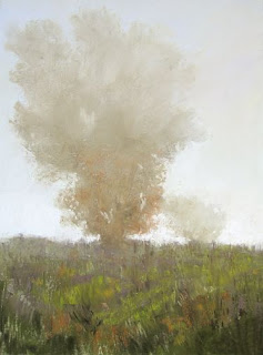
Frosty Glow, 9" x 12"
(With thanks to The Pastel Journal where this was originally published, with additional material included here.)
The painting looks washed out, as though someone poured bleach over it and left it in the sun too long. All the colors appear faded, like jeans after years of wear or an old flag left to disintegrate, a vague suggestion of once-bright colors. The overall effect is dull and flat. Chalkiness is a problem that can crop up in any medium, but is often found in pastel paintings, partly because of the abundance of pale colors that are available. The whitish, wishy-washy colors of a chalky painting suggest a lack of control over value, contrast and color.
A high-key painting need not be bland and characterless. Instead it can celebrate the light by maintaining control of tones, using a range of values and the right contrasts for the subject. Although the darkest dark may only be a medium value in the final painting it must nevertheless present a selection of values leading to the lightest light.
One way to defeat chalky color syndrome is to try two different challenges: First, paint an all-white subject using no actual white pastel. Second, paint a very high-key subject in which a medium value functions as the darkest dark. Each of these exercises will strengthen your understanding of how to control values while using colors. Value is the element that describes the shapes of objects and is the underlying abstraction of all painting, so increased awareness of value improves composition as well as color.
WHITE WITHOUT WHITE
Begin with an all-white subject, which may reside inside the composition, such as a white cloud or whitewater rapids, and work to create interesting colors hung on a sound tonal structure while maintaining a sense of whiteness. Because of the temptation to pick up pure, bright white, remove it from your palette and put it where you cannot see it. Good planning must lie behind your painting, in which you first create an arrangement of interesting values and shapes. In this challenge you need not limit the values. In fact, it’s best to design a strong tonal contrast of dark darks and an excellent range of middle values to use against the light colors to achieve the impression of whiteness. Don’t use bright white paper, which will simply allow you to replace the missing white with the color of the ground. Instead, choose a light value tone in a pleasing color to set the mood of the painting and establish its overall paleness. Do not allow the white subject to become simply black and white. Utilize colors to arrive at the proper tones. Many times an over-reliance on high contrast alone results in a chalky painting. Instead, a range of strong middle values accomplished via color will make an interesting all-white subject.
Cold River Runoff, 9" x 17"
How much color can you put into white? One of the most interesting aspects of white is that it’s made up of all colors in the light spectrum. Overlapping red, blue and green spotlights can make white light on a stage, as long as the colors are equally balanced. For the artist, this means white may be flavored with any color found in nature. Consider the color cast that varying light sources give to objects. Our sun is a yellow star and gives warmth to all colors seen in daylight. In shade, the blue of the sky influences all colors, so whites seen in daylight can generally be thought of as warm yellow in the sun and cool blue in shade. However, there are varying kinds of daylight. On an overcast day the light is often cool in color, having been filtered through clouds, while at sunrise or sunset the light is strikingly warm in color. Whites seen under these conditions can be darker shades of blue and green or warm, bright tones of red and orange. Moonlight, because it is so pale, bleeds all color from a scene, leaving ghostly grays in place of whites. Firelight and candlelight make white into hot red and orange. You’re free to select from an endless array of light colors because of the fact that white contains all colors.
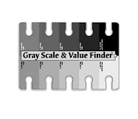
 One particularly important tool to have on hand is a value finder. While there are many varieties, essentially this is a card printed with a scale of grays from black to white, each of which is pierced with an opening. This allows you to hold the card above a color, squint until your eye is almost closed and see where that particular color blends into its value of gray. For instance, you can hold the card above a photograph of clouds and perceive the lightest lights in the white of the billows, as well as the paler grays of the blue of the sky. There is no standard number assigned to values on the value finder. The number 10 does not always represent white. In fact, 10 might easily be called black, so disregard the actual number but understand that there is a scale of dark to light.
To check the values of your colors change a photograph to grayscale on your computer. This will allow you to clearly see how the colors translate into values. Check to make sure that your subject appears to be white in the grayscale version and that you have the proper array of values.
MIDDLE VALUE AS DARK
For another challenge, paint a subject that’s structured using mostly lighter values, such as a very sunny landscape. This is commonly referred to as a high-key painting. Use your value finder to establish the darkest dark in your painting as a medium or medium-dark value. High-key compositions must have an interesting variety of values between the lightest light and the darkest dark to avoid overly pale chalkiness, even if the darkest color is medium in value. Rather than relying on high contrasts of light and dark, look instead to color relationships. This will necessitate concentrated contrasts in color rather than a reliance on value alone. However, no painting can possibly divorce itself entirely from the issue of value, which is a basic property of color.
Fog, 12" x 9"
 You’ll need to select a value for your ground. Beginning with a middle value establishes the darkest tone for the entire painting. The test is to rely on medium values as the darkest darks in a painting of a light subject. It helps to create a careful study or underdrawing to establish a range of values from medium to light. In this painting you are allowed to use white for the palest value, however, after your experiments painting all-white-with-no-white you most likely will find that white seems somewhat dead, giving a ghostly chalkiness to the piece. The idea here is to use vibrant colors that bounce and play together, achieving an overall high-key value structure that’s nonetheless colorful. The effect may be one of intense heat, giving the impression of a hot summer day or powerful sunlight warming everything in the scene, even when predominantly cool colors are used, or may result in the cool, pale effect of fog or early morning light. Confirm your limited value range by laying your value finder down alongside the painting, or put a strong dark line next to the image against which you can check your colors so that you can more easily identify darks that are becoming too deep for the limited range you’ve established. Step back frequently to see that the intensity of colors you’re using approximates the light on the subject.
CONTROL
As you conduct each of these exercises your control over value will increase, as will your understanding of how to use colorful lights. You will begin to see the color of light in all its many hues, and realize that pale color does not mean lack of color. Chalky paintings with an insipid, dull look will soon give way to lyrical colors in pale values that vibrate together in a well-planned structure of values.
Sanctuary, 12" x 9"


Deborah,
ReplyDeleteYou've heard this many times but I want to add my heart felt thank you for this wonderful book. You have renewed my faith in the goodness & generosity of mankind! I am learning so much from every chapter and your beautiful paintings help to guide and inspire me. I was wondering if it is possible to ask questions about the older chapters? Also, how long will the book remain on your site? I would love to study it all again. Thank you Deborah, you are an amazing teacher and I feel so fortunate to have this opportunity to learn from you.
Jude M
Idaho
Thank you so much, Jude. It's always nice to hear that the book is helping! This is what I believe:
ReplyDelete"A good person produces good things from the treasury of a good heart, and an evil person produces evil things from the treasury of an evil heart. What you say flows from what is in your heart." Luke 6:45 NLT
You're more than welcome to post questions in the comments section below any of the older chapters. I moderate the comments, so I'll try to answer anything that's asked there. Please don't hesitate to ask because it's likely there's someone else wondering about it, too!
I have no plans to remove the book in the future, so it should all remain available to you for as long as you want it. Enjoy!