Monday, February 13, 2012

CHAPTER NINE -- SUNRISE, SUNSET

(With thanks to The Pastel Journal, where this chapter was originally published, with additional material included here.)


The Edge, 18x24"


For decades, many an art student has been told that painting a sunset is a waste of time and talent, overused, hackneyed and stale, an exercise in the unimaginative. Yet who has not wished, at least secretly, to paint the fiery sunset over the plains or the delicate colors of a summer sunrise, inspired by its natural beauty? Artists want to share that momentary experience, to paint the exhilarating colors, yet this subject is relegated to the child who is considered too unsophisticated to know it is merely a “formula” painting.

How can we redeem a subject that has been so thoroughly rejected by jurors, professors and art critics? Perhaps we must come at it with more than the eyes of the child, ready to paint the breathtaking splendor of a new day or the glory of its finale. To meet the challenge of making a painting that is not simply a trite recipe or a reiteration of what has already been done, takes a little thought and planning, and the willingness to respond to what is there and take a few chances as you paint.

Paramount to painting a sunset sky that is not commonplace or overly romantic is the need for careful composition. Design your painting so that it has a center of interest, a reason for existing beyond being another beautiful sunset. The colors may have been spectacular, but ask yourself what particular vision you bring to this painting beside color alone.

When was the last time you tried to paint a sunset on location as it happened? Most artists rely on a photograph to paint such a fleeting moment in time. Things change quickly at that time of day and a photograph can capture the rapidly changing sky colors and cloud patterns.

However, if the last roll of photos you took of the sunset or sunrise ended up as a lot of washed out colors with hardly any contrast, you might need to increase your skill with the camera. That said, it is best not to rely on the camera entirely.

First you must record the colors in your memory. Pay close attention as you watch the fleeting changes in the light. Remind yourself that the blue of the sky was almost green at the horizon or that the shadowed clouds were a delicate lavender color. Name the colors out loud, if you can, and resolve to remember them.

Practice seeing. Try “painting” the sky in your memory, rather than simply using the photograph as a resource. As you develop this habit, looking at the photograph will increase your ability to recall the colors you actually saw while there.

You might also make some rapid line illustrations with notes on what you observe. Quickly draw out the patterns and jot things down, perhaps recording the color of the sky at the horizon and over the tops of the clouds, or the progression of colors as they move upward from the horizon. Note the color of the clouds where the sun shines through at the last moment, perhaps bright orange, salmon pink, magenta or gold. List the layers of colors you might put down, such as deep yellow gold, medium yellow orange and pale orange, to describe how you might approach painting that color. This line drawing is only to remind you of what you saw and may not mean anything to anyone else. Develop your own shorthand for what you see and use it to aid your memory.

As difficult as it might be to set up and be ready to paint on location before the sun rises or sets, color sketches made as it happens can help you see and remember details more precisely. Ask a companion to photograph the sky as you make your rapid color sketches on location so that you have line drawings, color sketches and photographs to refer to when you are ready to paint a finished work in the studio.

One thing significantly different about a sunset or sunrise is that the angle of the sun is below the clouds, rather than lighting them from above as in the daytime. This means that the bottoms of the clouds become light and colorful, while the tops are cast into shadow. This reverses the usual order of “warm on top, cool on the bottom” and sometimes casts shafts of shadow or rays of light into the clear sky. These can be very challenging to paint, but it may be worth the effort to develop a technique to depict them.

Molten Moment, 12" x 18”
Remember that clouds are composed of water droplets or ice crystals that tend to bounce the light around inside them, making them glow. Even in shadow, clouds will have some light within them, showing their volume. Don’t miss the way shadows wrap around a cloud, giving a sense of shape and showing how they overlap one another.

Often you will see a “silver lining” when the cloud is almost directly between you and the sun. This brightly lit edge will usually fool the camera’s eye into over-darkening the part of the cloud obscuring the sun, but notice how in reality soft light is held inside. However dark the cloud is in shadow, there is a sense of the light inside.

Look for places where a hint of sky comes through the cloud, giving it a cool, airy quality, as if it is somewhat insubstantial. These sky holes and sheer spots make your clouds appear to float in the sky, suggesting the billows caused by the wind. Use small touches of sky to move the viewer’s eye to your center of interest.

One caution: The destination of the painting will almost always be the ball of the sun if it is just above the horizon. Like a road or other visual pathway, the convergence of color, light, contrast and detail at the apex of the setting or rising sun is an almost unavoidable visual target. If you do not want that as your center of interest, risking the label of trite or ordinary, do not include the ball of the sun itself in the image. Let it dip below the horizon instead, as you draw the eye to another focal point.

Why is the sky red at sunset? We know that sunlight contains all colors in the spectrum. The atmosphere around our earth scatters the light, usually resulting in the short-wavelength blue of daytime skies. In the evening the sunlight travels through much thicker atmosphere as the sun drops on the horizon, allowing the longer wavelengths to be scattered by dust, smoke and other small particles in the air. The result is that first blue, green and yellow light are slowly filtered out, leaving orange and red. You will see the most spectacular sunsets during times when there are dust particles in the air, such as after a volcano has erupted or when there are water droplets scattering the colors.

The colors of the sky change accordingly, depending on the amount of daylight remaining and the location in relation to the orange-red of the setting sun. Color hangs in the sky in an arc around the setting sun, yellow nearest the sun, becoming progressively more green and blue, finally blending into the dark purple of oncoming night.

Here is your chance to use some long-neglected colors -- brilliant orange or piercing magenta -- colors you love but hardly ever pick up. You may enjoy using bright, out-of-the-tube colors that have been ignored in your palette. Lather the sky with neon green and drench the clouds in luminous yellow. Be adventurous.

Mud might result, but only if you mix widely varied temperatures together too thoroughly or over mix complementary or tertiary colors. You can keep colors fresh by using strokes that remain somewhat unmixed, so that the colors and layers remain lively and vibrant.

This does not mean that you should avoid using complementary colors. Rather the opposite -- the deep blue and brilliant orange standing side by side may be what gives the scene pizzazz. It’s the contrast of fiery red and pale green, fragile yellow and rich purple that brings expression to your painting. Only be careful to retain the authority of each color, rather than over-blending them into a frowzy, run of the mill gray.
Smoldering Moment, 11" x 22"
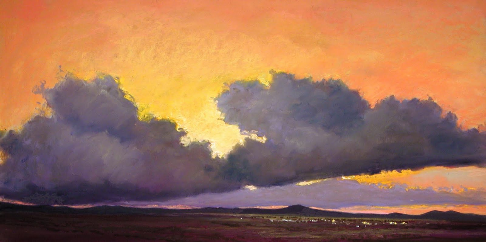
But there is a place for beautiful grays in your painting. Look for the way neutral colors in the clouds enhance the stunning, clear colors of the sunlight. Take care not to allow the grays to become gloomy or ordinary, which will detract from your painting. Instead, make them a subtle and interesting blend of colors in the painting, perhaps carefully layering colors to achieve a gray using a mixture of lavender, green and peach. An interesting, quiet gray can be the perfect foil for the louder colors you wish to feature.

Sunrises tend to be soft and delicate, quieter in color than a sunset. The clouds may be wispy, not yet raised up by the heat and wind of the day. Often the contrasts are muted, juxtaposing fragile, pale grays with watery pinks, yellows and blues. The sky is often a calm, agreeable blue made by layering the palest hues of turquoise and cobalt. The same spectrum of colors exists around the rising sun as those at sunset, yet they seem not to have the same fire or heat.

At sunset, when the dust of the day has scattered the light into a riot of colors, great contrasts might be seen, often incorporating deep darks where dense clouds have been formed by wind and moisture. Try using rich blues layered to create the impossible, deep green-blue-purple of a sunset sky against which colors explode.

One tool that is quite useful for manipulating clouds in pastels is called a Colour Shaper. This gadget has a rubber tip that can easily grab colors and move them around, much the way a paintbrush does. For small, delicate details, nothing beats a fresh, quick dab using the flexible tip to lift a bit of the blue of the pale sky at the horizon and place it in the midst of the dark purple clouds at the horizon, or to grab a touch of lavender-gray cloud and deposit it amid the cool, clear sky. It helps to wipe the tip on a paper towel or rag to remove colors between strokes and keep them clean.

Although the camera will almost invariably reduce the foreground to a mere blackened silhouette, do not neglect this area in your painting. The ground plane is still an integral part of the painting, even if it is darkened. It needs to be more than a black paper cutout shaped like a mountain or tree.
The setting sun often highlights the land, as well as the sky. Look for the colors of the sky cast onto the intervening landscape, as well as shadows created by the light. You can use simple shapes to make a range of darkened mountains or an intervening line of trees, using dark greens and blues, or add a blush of dark pink, deep maroon or velvety gold to a field in front of dark hills.

At sunrise the land plane is very dark before the sun actually rises over the horizon. However, though that is a dramatic moment, sunrise is not ended at that point. Spend a while studying how the land colors change from the first blush of morning to the full sun of daylight.

Take a few chances as you paint the sunrise or sunset. Often the clichéd sunset painting disappoints because the artist fails to try something new. Experiment with a different kind of paper. Try making your own surface. Paint on an outrageous color or on black paper. Turn the painting upside down and look at it as a series of shapes and colors. Reverse the colors, painting in complements first, then revert to the natural colors -- just to see if it makes your color more exciting. Paint a series of pieces from the same photograph or color sketch on several different colored backgrounds to see how the ground color affects the painting.

Have some fun. Take some risks. Try a few new things. Push yourself a little and get out of the comfortable rut that results in a formulaic painting.

Above all, compose your painting so that it is interesting and varied, not the same old approach of a flaming sky over the silhouette of a black mountain, the ball of the sun caught forever as it tops the peak. This is a stale approach to a potentially brilliant composition. Do not rely on the subject matter alone to make the painting.

Instead, make your painting technically superior. Look for a striking composition that transcends the standard “pretty picture.” There is an underlying abstraction to any painting, especially that of an early morning or late day sky. This is a time when things flow and change rapidly, allowing you to choose those parts that will enhance your composition. Judge the negative and positive shapes, analyze the contrast of colors and values, the juxtaposition of brilliant colors with grays, the movement of the eye through the elements, the contrasting textures of the land and the sky.

The childlike part of the artist longs to communicate the grandeur of the sunrise or the majesty of the sunset. The formula can be surpassed when the artist responds to the urging of simple beauty using what she knows, pushed by experimentation, resulting in originality. This is the place where creativity lives, disciplined by experience and skill, allowing the artist to express wonder artfully.

Morning Glow, 12" x 18"


Sunday, February 12, 2012

CHAPTER TEN -- NIGHT

(With thanks to The Pastel Journal, where this chapter was originally published.)


Nighttime City, 17" x 23"

Evening scenes intrigue us. Darkened skies allow soft shapes and patterns to emerge from shadows as the eye is drawn to the glimmer of warm lights amid the cool colors of twilight. The night reveals only some details and allows the mind to complete the picture. The subdued light and softness of evening evoke a certain mood in a painting. “In the shadows the mysteries dwell,” mused Leonardo da Vinci. However, in painting the night, darkness is always defined by the light.

Night paintings are low-key in value and color, often with areas of brilliant light to draw the eye. The use of powerful darks -- deep but colorful -- can strengthen a painting, while areas of light allow vivid medium and light colors to punctuate the dark. The night sky is cool, and headlights or city streetlights interrupt the darkness, unless the moon rises to cast its soft glow over the landscape. A fleeting sunset lends ethereal colors to the sky as the blush of color from the setting sun lingers for a few minutes and the lights of the city begin to twinkle in the distance. Stars and clouds decorate the night sky, setting the mood for the painting. These can be especially vibrant subjects. Night offers different challenges and much beauty to the artist.

SHIFT IN CONTRAST

To paint the night it is necessary to shift the contrast of the painting into a quieter mode, allowing the darks to dominate, yet not neglecting the light areas that are the backbone of a nighttime painting. Of course, without light nothing can be seen. No matter what the subject of the painting, it is the light that we must paint.

The saying, “in the dark all cats are gray,” illustrates the problem one encounters. In the dark, the sensitive cells of our eyes become less responsive to color and we rely far more on value-related black-and-white vision. This is the reason we have trouble finding two socks of the same color in the early morning light of the bedroom, unless the choice is solely of black or white. In dim light color becomes muted and dull, intensity is subdued and all colors take on a slightly grayish cast. However, this graying and dulling of colors in the dark is what allows the intensity of light to work in a painting. The blaze of light attracts the eye and reveals the colors.

So how can we make interesting and lively paintings of the evening? First we must change the value range in the piece. Instead of relying on the usual dark, medium and light scale of a normal daytime scene when the daylight is creating many medium values throughout the painting, we use a narrower range of dark and light only. The medium values and colors become much less visible except where there is light cast on the subject. Everything in the dark stays fairly dark and only those things in the path of the light are bright in color. This higher contrast of dark and light can make a strong painting.

USING STRONG DARKS

The majority of colors used in a night painting will be dark, so begin there. Use a variety of subdued shades, layering them together to form fascinating colors that are interesting and deep.

Do not depend on black for the dark areas. Although black may be layered beneath colors to achieve the desired shade, it tends to be a cold, stark color when used alone. Vincent van Gogh once wrote about his painting titled Café Terrace, ". . . here there is a night picture without any black, nothing but beautiful blue and violet and green, and in those surroundings the lighted square is colored sulphur yellow and limey green.” As van Gogh did, use beautiful colors -- deep, dark blue, green, purple or red -- layered over black or atop another to make pleasing and vibrant darks.

Your colors need not all be cool, though most will likely contain some cool notes. Remember that your nighttime painting will utilize a lot of dark colors, so work to make them a strong portion of the piece, whether warm or cool.

Spend time outside at night observing how much color you can see. Notice the fascinating darks and how they are made distinct by light. Look for the colors you might use to make a painting -- dark and light. See how medium values exist only in well-lighted areas, and note that streetlights have a slight halo around them in the dark.

Night Street, 12" x 9"
USING STRONG LIGHT

Areas of light can occur as pinpoints in a night scene, such as streetlights or car headlights, or as a broad pane of light in the window of a house, so it is necessary to carefully compose using them. It is easy to end up with a piece that looks spotty, with points of light scattered in a disjointed way across the painting. Design with the thought of how the viewer’s eye will move through the piece.

Remember that the area where the lightest light and the darkest dark come closest together will draw the eye first and become the focal point of the piece. Sometimes in a dark painting the largest area of light will become the focal point, such as a large window where the light pours out. Be sure in either of these cases that the visual pathway formed by any other points of light compliment and reinforce this focal point, rather than draw the eye away.

Light areas in a night painting are the perfect place to use exciting colors, such as the sulphur yellow and lime green of the lighted square in van Gogh’s painting. The contrast of dark surrounding the light accentuates it, making it a special feature of your painting. Different kinds of bulbs cast light of varying hues. Incandescent bulbs are warm and yellowish, fluorescent light is generally cool and neon light is intense.

All bright lights at night have a slight halo, a softening of the edges where the light seems to hang in the air. The night air is somewhat moist and this vapor holds the light inside it. The larger the light and the wetter the night, the bigger the halo tends to be. Technically, you can achieve this effect by saving an area in the dark plane where the light will be, then laying in a medium color, perhaps a red, and blending it slightly into the surrounding darkness. Then add a layer of a medium-light color, depending on the color of the light itself, and allow the color beneath to show at the edges. A final touch of the lightest color in the center, usually very light yellow or white, simulates the brilliance of the light shining in the darkness.

THE NIGHT SKY

Theoretically the night sky, when it is without the moon, stars or clouds, is a velvety deep black. Once again, flat black is not your best choice. Try using deep purple, dark blue and black, even adding a touch of the darkest green to the mix. Starlight can add a touch of violet to the darkest sky.

Even at night the sky is still slightly lighter in value compared to the darkened land plane, though it will not be the lightest value in the painting if there is a light source showing. The evening sky appears somewhat lighter than you think, especially in the early twilight. Carefully choose the value of the night sky, using colors from the cool side of your palette.

The night sky has a cool cast to it. No matter what color you decide to use, all colors are flavored with a bluish tone. At sundown, make yellows slightly green, pinks somewhat violet and greens bluer in hue. Remember that the darkest colors are at the top of the sky, highlighted by sunlit clouds beneath or punctuated with evening stars.

Let the glow of sprawling city lights in the distance, or the radiance of the soon-to-rise moon, illuminate the sky a bit, revealing mountains, hills, houses or trees in silhouette. The radiance of a mass of city lights can brighten the night sky to almost daylight proportions. Structure this kind of painting so that darkness hangs between the buildings, allowing the lights to shine brightly.

Night Overlook, 9" x 12"
THE MOON, STARS AND CLOUDS

The moon can be a delightful addition to the night sky in your painting, though its brilliance against a velvety dark sky can be arresting. Early in its trip across the sky, the moon can appear quite large and very yellow because of the magnifying effect of the atmosphere on it as it rises. When painting this, be sure that the high contrast of the light moon and dark sky contributes to the composition without becoming distracting.

Moonlight, even when the moon itself is not included in the picture plane, can define the characteristics of the landscape, describing hillsides, trees or buildings. Contours and shapes emerge from the darkness, muted by the night, cool in color, but still describing forms. Sometimes moonlight will be reflected off of particularly light objects and cast a secondary shadow. Look for light bouncing from a white building or wall and casting a deep shadow behind the foliage next to it. In deepest dark such secondary shadows do not exist.

A starlit sky may be a velvety dark violet or may softly glow dark purple with pinpricks of light floating in it. Use soft pastels in medium-light colors for the majority of stars, reserving the lightest color for the brightest stars. Remember that the light from the stars has traveled a great distance and is not the lightest light in the painting. When painting stars it’s best to keep in mind that fewer stars add more visual impact.

Clouds can add a blush of color in a moonlit sky, sometimes iridescent as mother-of-pearl, sometimes warm or cool gray. They serve to soften the shine of the moon and lend mood to a painting. They can foil the brightness of the sky, focusing the eye on the land plane instead.
Night's Colors, 9" x 9"
SUNSET SKIES AND CITY LIGHTS

Sunset skies, when the atmosphere is alive with a blush of color for a few minutes, can add interest and sparkle to your paintings. The light level has diminished enough that the value contrast is reduced, adding the chance for city lights shining against the medium-dark colors of the land.

The darkening sky is very bright at the horizon as the sun dips below the land plane and the angle of the light is increased. The zenith of the sky may be dark enough that, even as the sun sets, there are stars beginning to sparkle overhead.

City lights in the distance can be a particularly interesting subject to paint. Observe such lights carefully, noticing how streets lined with stoplights, brake lights and headlights line up to form yellow or red streaks. Study how the sizes of the points of light indicate distance, the smaller pinpoints farther away. Look for red and white lights on the tops of hills or buildings, at the highest point. Indicate the sprawl of the city and the interruption of the hills, mountains or rivers with the pattern of lights. Include trees and other foliage amid the lights, which helps to illustrate the contours of the land. Add touches of red, green, yellow or orange from business signs, taillights and neon signs.

Night paintings can be a delightful challenge to paint. The contrast of the somber and the spectacular can be captivating, giving you endless opportunities for paintings. From city scenes to moonlit night skies, to the starry sky decorated with clouds, keep the mystery and mood of night paintings in mind and let the light define the darkness.


San Diego Fires, 9" x 12"

Saturday, February 11, 2012

CHAPTER ELEVEN -- TREES

(Thanks to The Pastel Journal, where this chapter was originally published, with additional information included here.)

Springtime Shade, 11" x 17"

Think back to when you were in first grade. Do you remember the landscape you made up, the one with the tree standing next to the house with the sun and cloud behind it? Your tree may have been a lollipop shape with a wavy edge or it could have had apples on it. Maybe it was the traditional Christmas tree shape, a large serrated triangle with a little square protruding from the bottom. That tree you remember is the shortcut you settled on a long time ago, the symbol for tree that you’ve had stored in your brain ever since. Maybe you’ve caught yourself using that symbol, or a version of it, when you paint a tree. It might pop out when you haven’t planned well and decided to add a tree to a painting. Your first grade tree, or an adult adaptation of it, that’s slightly more sophisticated but still fairly simple and symbolic, looks childish and oversimplified. This becomes a problem when you find yourself relying solely on the symbol. When you haven’t spent time studying trees, looking closely at the trunk and branches, foliage and bark, blossoms and fruit, you may too easily slip back to that elementary representation of a tree.

Trees come in an immense variety of shapes, sizes, colors and patterns. It’s difficult to know how to paint every kind of tree but as an artist you should develop a working knowledge of the general characteristics of trees so that you’re able to paint any you observe. You should study trees that are common to your area so that as you paint the landscape you can easily portray them, whether they’re to be the stars of the show or only appear in a supporting role.
The Light, 23" x 17"
First you must understand the anatomy of a tree in order to paint it properly. Just as a portrait painter must have knowledge of the bone structure underlying the face, you must understand the skeletal underpinnings of the tree. Think of the trunk and branches as the skeleton, the bones that frame the tree, on which the decorative clothing of the foliage is hung. Study deciduous trees in winter when the cold has removed the distracting cover of leaves, much the way the artist must paint the unclothed figure in order to come to understand the anatomy beneath the clothing. This way you can clearly see how the trunks relate to one another and how the branches spiral out in a loosely radial pattern along each trunk.

If you were able to look down on a tree from the top you’d notice this pattern repeated over and over, in the habit of trunks, branches, leaves, and blossoms. In order to picture this design, think of the barber pole where the spiral rises continuously. A tree rarely puts out branches at even and opposite intervals along the barber pole. One of the reasons an artificial Christmas tree looks fake is the intervals are too exact, with a branch sprouting out at perfectly opposing and predictable distances, unlike the real thing. On a real tree, the larger branches develop smaller branches in a roughly radial spiral pattern, as the tree grows taller. Leaves, buds and blossoms grow correspondingly. This corkscrew arrangement generally holds true for all trees from oak to pine, weeping willow to palm, with some obvious variations on the theme.

You can use this knowledge to your advantage in painting any tree. It’s one of the methods used to portray a three-dimensional tree instead of the flat, cutout shape of your first grade tree. Find branches that come toward you and go away, as well as those that grow side-to-side. Look for the balance, as branches shoot off one way and then, slightly higher up, in the other direction. Your first grade tree was probably fairly symmetrical and straight, drawn in a childish scrawl yet balanced and proportional. Now look for the way the tree leans and balances itself, how it puts out a root to hold itself upright or shoots a branch one way and then the other to maintain its equilibrium. This is often like a ballet, hard work that looks delicate and easy.

Remember that trees must be balanced to remain upright, although their tenacity is amazing. Once the root system is well established a tree can remain upright even when part of it is severely damaged. A lightning strike can destroy as much as half the tree and yet it can live on in its injured state because each trunk achieves a certain balance on its own. In the arid southwest near my home you can sometimes see a tree that’s growing along an arroyo, the bank of which has eroded away and left the tree growing horizontally out of the wall. The tree has righted itself and grows up toward the light with a 45 degree bend in the trunk. All of the other branches have arranged themselves to balance the tree in its upright growth.

Trees are competitive, though in slow motion, of course. Like any green plant, they need light to grow and survive. A mature stand of trees has fought the battle and each has established its little domain of available sunlight. Small trees may spring up in the shade of a larger one but won’t survive long for lack of sunlight. All of the branches on a tree need a certain amount of sunlight to thrive and the radial arrangement of branches, as well as the tapering habit of most trees, allows sunlight to reach all of the leaves. Branches inside a shade tree that don’t receive adequate light will die and eventually fall, so be sure to study the layout of branch and leaf patterns.

Blanco Grove, 11" x 23"
A mature grove of trees tends to interlace the finest branches at the outside edge of the foliage only, almost as if they’re at arm’s length. Younger stands may yet be battling for the light and can be more intertwined and closely related to one another, depending on the variety of tree. Sometimes these groves develop at the same rate, especially when there has been a fire and the seedlings have germinated simultaneously afterwards, in which case the trees may remain intertwined for life. When one is taken away, the remaining trees show evidence of the interrelationship that’s now gone, as they’re left bent and oddly balanced. Slowly the gap will become filled with foliage from neighboring trees that straighten up or lean into the breach, always maintaining their balance.

TREE STUDIES

In order to become adept at painting trees, choose one tree to study closely. Spend time looking at the whole tree, its growth pattern and habits. To become acquainted with the tree you might resolve to draw part of it every day for some length of time, perhaps a particular branch, then the trunk and bark, then the blossoms or leaves. Observe your tree at different times of the day and in different seasons, recording the changes. This intimacy with one tree can enhance your perception of all trees as you begin to learn the habits and patterns of trees in general and is a sure cure for the artist who suffers from ‘elementary tree syndrome.’

Tree Study, 9" x 12"


Consider the roots. Although they’re hidden, remember that beneath the ground this structure of roots is vital to hold the tree in place through all but the fiercest of storms. Roots normally grow outward to about three times the spread of the branches and anchor the tree in the soil as they penetrate the earth in search of water and mineral nutrients. In some varieties you can see the larger twisted roots at the base of the tree as they travel along the surface for a distance before delving deep. As you paint your tree remember what is underground supporting the tree, in order to avoid making your tree look like a bottle sitting on a shelf or a lollipop stuck in the ground in a pretend world.

Now explore the trunk of the tree. Try to capture the gesture of the trunk as it emerges from the ground, preferably as it leans into the picture plane. Does it twist or bow? Is it round or oval? Does it bulge or rise quickly, perpendicular to the ground? There may be two or three major trunks in an established tree, each growing in a slightly different direction, related but separate from one another. Avoid making the trunks perfectly straight or parallel to one another. Don’t fall back on that lollipop stick, straight and tall. Instead, vary the directions of the trunks to divide the space in an interesting fashion. Notice that the angle created by the spaces between trunks is wider than the angles of the branches above. The trunk is holding a tremendous amount of weight, which causes the larger gap, so look for its strength and suppleness.

Take a close look at the bark of your tree. Is it craggy and gnarled, flat and smooth, crumbled and peeling, or some variation of these? Bark is a characteristic that identifies different species as surely as do the leaves. The bark is the tree's protection from the outside world, its skin. Young trees, and the younger branches on any tree, have smoother bark, so look for the smooth suppleness of the outer branches. The loosely organized ridges and fractures of bark, running in roughly vertical stripes up and down the length of the trunk and branches, can indicate to your viewer the direction the limbs move in space. To illustrate this idea, pull your sleeve down over your hand and grasp it firmly. Now twist and bend your arm and notice how the ‘bark’ shows the movement. Paint with this in mind.
Winter Juniper, 17" x 11"
As a child you colored the bark brown or gray but now you should look for the many color variations you can use to create a more interesting effect. Instead of using gray, layer complementary colors on top of one another or arrange them side by side to create a visual blending that suggests a lively gray. Instead of using brown, do the same with tertiary colors, putting together orange-green-purple, red-blue-yellow, or some interesting variation on this idea.

Shadows help show the shape of the trunk and branches and what directions they move in space. Where they cross the bark they can create a fascinating interplay of colors. The bark will be slightly darker and cooler in color in the shaded area, creating an interesting relationship to colors in the light. Technically you may approach shadows by feathering a light layer of soft charcoal or dark blue pastel pencil over the bark colors you’ve laid down, which darkens and blends the pastel slightly. Or you might reserve the shadow areas for entirely different colors, darker and slightly bluer, to contrast with the bark colors. There may be places where darkness creeps along the edge of a crevice in the bark as the light catches the rough edge of it. Touches such as these can make bark one of the most interesting parts of the painting.

Remember that branches grow thicker at the base and slimmer at the tips. Avoid ‘thigh’ shapes, thin, thick, thin, which can distract your viewer unless you’re focusing on painting a misshapen burl. One of the pleasing characteristics of trees can be the lithe growth, their lightness and airiness, almost as if they’re standing on tiptoe.

Evening Stand, 9" x 12"
Strive to make a three-dimensional tree, one that has depth as well as width and height. Some branches come toward you, while others lean away. If a branch is headed directly at the viewer it will be severely foreshortened or appear to be a mere spot, and can be somewhat difficult to see unless branches protrude from the sides in varying directions. A branch that’s moving backwards will be in perspective and the converging lines of bark can help achieve this illusion, as well as the lightening effect of distance. You can also indicate the depth of the tree by carefully rendering the light and shade on each branch, which will help to show its direction. Try not to make any branch perfectly cylindrical or it will look like a stovepipe. Branches have gesture and flow to them, much like arms or legs. Avoid ruler-straight lines that make your tree look stilted and unreal, back to the lollipop shape again. At the top the tree supports a multitude of small branches that hold the leaves, forming the canopy. Paint your tree with progressively smaller branches and avoid a heavy branch at the top or outside.

Trees are radially symmetrical, meaning both halves are roughly the same. You could place a mirror at the center of the tree and see a matching image. However, try to paint your tree so that it isn’t simply made up of two identical halves but has asymmetrical qualities that make it more interesting. Broken branches or ones that have been cut off can change the balance of the tree, often making it look oddly lopsided. Be sure not to return to the boring symmetry of your first grade tree once again.

When a branch is cut off at the trunk it leaves a rounded oval scar that heals over time, though it won’t re-grow bark. Instead, the knot develops a ridged callus that protects the tree from insect invasion or decay. Look for the pale oval of healed cuts on the trunk for color variation, shadows and texture.

Unlike the lollipop tree, now your tree should be a sophisticated study of the trunk and branch patterns that shows the asymmetrical balance and the agile movement of the branches, using bark details and shadows to show movement. This tree is alive and growing, moving in the breeze, as it holds its weight of branches and leaves easily.

(Next week: Foliage.)

Friday, February 10, 2012

CHAPTER TWELVE – FOLIAGE

(With thanks to The Pastel Journal where this was originally published.)

At Rest, 12" x 9"
The drape of leaves, like the folds of fabric covering a model, is dependent on the form beneath. Unlike the hard skeleton, foliage is gentle and flowing, wrapped over and around the structure of a tree. We’ve analyzed the trunk and branches of the tree and now we need to spend time looking at the leaves clothing the tree in softness and color.

Foliage can be seductive, often tempting the artist to over-detail each leaf in an effort to describe the complexity found there. Painting foliage should be like writing poetry, a simple, spare means of describing the details of the mass of leaves, one that evokes the soft resonance of the wind stirring the tree to life. The Japanese poetry called haiku might be the best model to use, a simple and stylized impression that’s brief but powerful, rather than a novel that laboriously describes each detail.

Instead of painting every leaf, find a stroke you can use to suggest the overall effect of the leaves. This might be a quick squiggle that hops and jumps over the paper, a slanting, repetitive stroke, or a random scribble that, when repeated, becomes a pleasing mass. Painting every single, meticulous, little leaf can be a dull activity for artist and viewer alike.

Use texture and color to indicate fine points in the mass of the tree. Instead of detailing the entire canopy, find particular places where you can use a detailed stroke to indicate the shape and pattern of the leaves. Think of the general shape of the leaves, long and thin ones on a willow, round and compact ones on a cottonwood, and develop a stroke that mimics the leaf shape well but does not require each leaf to be painted. Use this detailed stroke at the edge of the foliage against the clear sky, where a dark mass of foliage meets a lighter one, or where there’s a dramatic color change. These are the areas of interest that indicate the amount and type of leaves.

SKETCHING

Begin by sketching in the tree as one whole shape, a simplified geometric outline of a triangle, circle or oval. A pine might be a triangle, while an oak is an oval or circle. Find the outside edges of the entire tree, even if it’s off the top or sides of the paper, and make light marks that encompass it from top to bottom and side to side. This will help you keep from making the tree duck down, as if the top of the paper is a low ceiling, as well as helping you find the correct scale of it in relation to other objects in the painting.

Now sketch in the outline of the overall balloon of the foliage, as separate from the trunk. This time avoid a perfectly geometric shape. Instead find the rhythm of the tree, where it leans or bends, where gaps occur. Look for the gesture of the tree, as it leans in the wind or reaches tall and straight to the sky

The close-up at right shows the many colors used beneath the green foliage, as well as the detailed edge strokes of dark and light suggesting leaves.

Now locate the various branches and the large clusters of leaves they support, as defined by the light and shadow on them. If there’s a major branch, it will bear a major cluster of leaves. Likewise, if there’s a balloon of foliage it must have a branch from which it sprouts. Don’t leave one without the other. Remember that the smallest branches, numerous tiny twigs that each has a small bouquet of leaves, mass together to hold the foliage. Most of the time you won’t see these little branches amid the mass, except where they occasionally project, adding a variety of texture. Often a cluster of foliage will fall in front of large branches and obscure them, but it’s best to know where these branches occur, whether or not you see them clearly when finished. Usually there’s some evidence of them peeking between the leaves, as well as above or below the mass. Smaller branches weaving through the leaves can move the eye, enhancing the sense of three dimensions.

PAINTING FOLIAGE

Although there are many ways to approach painting foliage, one way is to lightly paint in a layer of color all over using a medium value, and then divide that up into the smaller foliage balloons. An open stroke, using the flat side of the pastel stick, is particularly good for this part of the painting. After establishing the overall tone of the tree, whether it’s green, yellow, or any other color, use a warmer, slightly lighter color for the areas in light and a cooler, darker color for those in shade. This light and shadow should show which foliage balloon rests in front and which is behind.

Negative shapes are an important consideration in painting a tree. Sky holes can be particularly beautiful, allowing a peek at the clouds, sky or land behind the tree, adding contrast and sparkle to the mass of foliage. Look for the syncopated rhythms of these holes, where clusters of leaves divide and light shines through. Design the movement of the eye through the trees using these breaks.

Green is a color that seems to perplex some artists. You may find you have a vast collection of green pastels that you’ve gathered in an effort to find the ‘right’ green. If you need to solve the green dilemma, try using warm colors beneath and amid the green. Dash in some orange or add a stippling of purple, red or ochre. The use of complements and near-complements jazzes up the color, exciting the visual receptors in the eye and relieving the sameness of green.


FOCAL AREA AND BACKGROUND TREES

Consider how warm, light colors appear to advance and cool, dark colors seem to recede. Use this principle to give the tree depth. As you paint your tree, establish a focal area, often using warm, light colors. Contrast that with an area in shadow behind it where you can layer cool colors, creating a visual tension that further enhances the focus. Be sure to include other foliage that overlaps, dark over light and light over dark, though to some slightly lesser degree.

Also consider the fact that inside the dense foliage of a tree there’s very little light. Look for dark shadows cast in the center of a tree and the light outside on the foliage. Different varieties of trees show this to varying degrees, some more open and light while others are dense and dark. Analyze the tree you’re painting with this in mind.

Remember that intense colors attract the viewer’s eye, pulling them visually to this area. Often this, coupled with an area of high contrast, will be the place where the eye goes first. You must then move the eye through the tree, often in a vaguely circular or oval pattern, enhanced by a detailed edge. Conversely, you can create a sense of distance by diminishing contrast, detail, edges and intensity. In a very large grove of trees, the farthest ones will be quieter, less intense and detailed, while the nearer trees will have a clarity and brightness that plainly establishes them as standing in front.

Patterns are useful in suggesting trees at a distance. Repeat the characteristic overall shape of the trees, whether tall and thin, triangular or rounded, and use muted light and shadow to indicate a tree-covered hillside or distant grove. Overlap near shapes over far ones and use accurate scale to improve the sense of depth. Remember, however, that patterns can also work against you, becoming lifeless and boring. Avoid unconscious patterns that make your painting dull, with no sparkle of life. The distant hillside has a supporting role but should not become flat and tiresome in its sameness. Work to achieve an interesting quietness that enhances the focal area of your painting in a strong way, but isn’t jumbled and distracting.

When you’re painting a grove of trees, be sure to vary the values, as well as the sizes and shapes of the trees, while allowing for repetition in trees of the same species. Don’t let every tree lean in the same direction unless it’s a characteristic of strong wind, such as the famous trees at Torrey Pines in California. Even then, don’t repeat the same forms over and over. Vary the shape as well as the texture of trees standing in a group, to some degree.

The old growth forests have developed a canopy of foliage that virtually blocks out sunlight beneath the trees, leaving a floor of mossy mulch and ferns that grow well in shade. When painting this kind of forest look for the deep shade of the floor and the brilliant contrast of sunlight in foliage above.

FLOWERING TREES

Flowering trees take on a soft, floating quality, newly dressed in a lacy veil of petals and soft, young leaves. The value of the tree is generally lightened when it flowers, often pastel pink or dazzling variations on white. This gives an opportunity to stretch your range of colors as you layer a great variety of them together to form the clouds of flowers on various branches. Look for a softer stroke that can indicate the petals, usually one that’s lazier and not as vigorous as that used for leaves alone.

Don’t forget that flowers adopt the habit, as do leaves, of growing in a spiraling pattern around each branch. You’ll notice that there’s a bit more contrast in a flowering tree, usually due to the darkened color of the branches in springtime growth, which are more apparent throughout the tree. Because flowers aren’t as dense as leaves, there isn’t as much shade in the interior of the flowering tree. Paint these springtime blossoms with a light, quick stroke to achieve the fluttering quality of the breeze moving them. Scatter petals across the ground, as well, where the wind deposits them.
Springtime Reds, 18" x 12”

FALL TREES

In the fall trees turn an amazing variety of colors, from blazing orange, red and yellow-gold to russet, ochre, and greenish-yellow, all the way to deep purplish-red. This is the time when you can devote your paintings to color, but be careful not to heighten the color of all the trees and miss the subtleties that let the colors resonate. Contrast bright colors with quiet colors, allowing the light to pick out one tree or a small grove standing against more muted, distant ones.
Fall Tree, 12" x 9"
All of the general rules for trees apply in the autumn, with a slight shift toward a lighter value in some cases, such as aspens. Trees that were medium in hue when they were clothed in green might change to a medium-light value when wearing yellow leaves, although at various times there can be blend of green and yellow that necessitates only a slight value shift.

It may be a good idea to use a colored filter to compare the values of the tree standing in nature, the photograph if you’re using one, and your painting. Use a blue filter if your trees are red, since a red filter will make red appear white, or a red one if the trees are green or yellow. The filter allows you to analyze the values in context with the rest of the painting so that you can clearly see how light or dark different parts of the tree are.

Your autumn painting might include trees that are beginning to lose their leaves, opening up the foliage and allowing more gaps where the braches and sky shows through. This can make for an exciting effect as the contrast in value and intensity between the fall leaves and the sky is quite beautiful. Remember to include fallen leaves on the ground, which are usually more muted in color and value because they have lost their vibrancy.

PINE TREES

Santa Fe Pine, 12" x 9”
Pine trees come in many varieties, from blue spruce to piñon to towering ponderosa pines, but all share some common traits. The general value of pine trees is medium-dark to dark, depending on the light source and the time of day. Shade the green of pines with a drift of orange in the sunlight and a hint of purple in the shadows, to excite the green. Pines usually grow well only at certain altitudes, so you find one type predominating in most areas, though there can be a mix of one or two varieties, as well. Pines generally don’t have an open growth pattern but are dense and closed, except at the very outside edges. A few pines tend to grow in a slightly more open pattern, especially long-needled ones. The classic ‘Christmas tree’ shape, a wide-based triangle, is characteristic of only a few pines. Most tend to have a much more cylindrical shape and taper only slightly at the crown of the tree. Analyze the overall shape before painting a pine tree and throw out any preconceived ideas you have.

Mastering the art of painting trees is necessary for the landscape painter and requires time spent observing them and time at the easel painting. One of the advantages of painting trees is that at different times of the day and in different seasons the same tree can take on such different characteristics, giving you a great diversity of subject matter in one place. When you’ve found a tree you admire, spend time studying it. Do you particularly enjoy the shape of the tree, the gesture of the trunk, the pattern of the branches, the shadows it casts in a certain light? Does the fall color excite you? Or is it the lacy dress of flowers on it in the springtime? Whatever it is about the tree that attracts you, return to it to practice seeing and recording its beauty.

Find your own voice, the poetry that describes the boldness or delicacy of the tree, spoken as only you can say it, and use it to describe the diversity and beauty in your rendering of trees.


Los Poblanos Autumn, 12" x 9"


San Carlos, 12" x 12"


Thursday, February 9, 2012

CHAPTER THIRTEEN -- FOREGROUNDS


Sunstruck City, 9" x 17"

Foregrounds can present a particular problem to many painters, regardless of what is painted there. This critical area can trouble professional artists and students alike. The foreground must function to support the subject of the painting and not distract the viewer’s eye.

Nothing distracts more than a weak, disruptive composition that allows the eye to meander, fixing on nothing and going nowhere. Instead, a strong foreground will lead clearly and succinctly to the focus of the painting, with enough detail to enhance that subject. A weak foreground can destroy the effectiveness of a painting that is otherwise successful. No matter how strong or visually delightful the center of interest, if attractive elements in the ground plane lead the eye away from it, the painting becomes disjointed and uninteresting. If, on the other hand, the ground plane is a bland sea of useless, rambling details, or is so devoid of information as to be visually boring, this area simply fails to do its job.

The fore is often the place where distractions occur. Because the greatest color, contrast and detail reside at your feet, it is necessary to walk a fine line between enough and too much if your center of interest does not reside there. Excessive detail can overburden the senses, heightened darks and lights may attract unwanted attention and strong color might appeal to the eye when it is not meant to be the center of interest. The solution is to take into consideration this key area and arrange the various components in the fore to direct the viewer’s eye, moving it quickly or slowing it momentarily, or perhaps allowing it to rest briefly in an area of quiet calm before moving on. The rhythm and syncopation of this movement is important and allows you to vary the tempo, pace and direction the eye moves.

Think about how you can use the fore to guide the viewer’s attention to the focal area (it may not be just a focal point but a grouping of items) and keep it comfortably centered there. Allow your viewer to arrive at the focal area, providing a visual pathway of some sort. This might be as simple as a trail of light that leads the eye through the foreground, or it could be as obvious as a paved highway with a yellow stripe curving across the land, pointing like an arrow to the center of interest.

It is sometimes tempting to minimize any foreground, cropping the image so that the offending or difficult part is simply cut out. This can often leave the subject sitting directly on the “windowsill” of the painting with no room to travel visually to the subject. While cropping might seem a simple solution, it actually contains pitfalls of its own since the need for excellent composition is often then increased. Instead of cutting out the offending portion, consider utilizing the space to strengthen the painting. The abrupt quality of the painting that is merely a subject and background, with no intervening sense of space, can be confusing. While this composition may be effective and interesting when done by a master painter, it’s not a solution you can rely on for every painting.

Far more often you want to use shapes to give mood and movement to the work, making the foreground a vitally important and motivating part of the composition, an appealing and lively portion that does not distract. Compose with two key ideas in mind: Create depth and keep the movement operative.

There are many elements you can include in the foreground plane to create distance and movement. Consider including a vertical element such as a tree or bush, telephone pole or fence to enhance the illusion of distance. When a vertical object protrudes into the more distant planes above, it functions much like a puzzle piece, locking the composition together in relation to the foreground.

Indigo Mesa, 12x9”
A streak of light and the shadow it casts can draw the eye and change the direction it moves. Overlapping grasses and bushes, large and small, can make a soft transition. Strongly contrasting colors or values, such as a patch of snow or brightly colored flowers, can entice the viewer. A change in plane where the ground rises or falls away can move the eye swiftly or slowly in another direction. Lost and found edges become important in pointing the eye, making a soft or abrupt shift.

Strong verticals create upward or downward movement and horizontals move the eye side to side, while angles can provide transitions between them. The place where these directional elements intersect can be critical. Pay close attention to the X or Y where they meet and maintain the movement in the proper direction.

Be sure to use patterning. Look for the repeated overlapping colors and characteristic shapes found on the ground, such as low-growing grasses, small bushes, flowers, weeds and dirt.

Rather than laboring to paint every detail of grass and leaf, use repeated patterns that are somewhat larger in the immediate fore and become progressively smaller. In the distance these strokes, laid down like tweed cloth with dashes of characteristic color, create a simple texture with muted color that explains enough without saying too much. Oftentimes patterning is the key to solving foreground dilemmas simply because it creates an illusion or suggestion of detail without becoming disruptive.

Keep in mind that the slight graying or bluing of aerial perspective is needed to add to the illusion of depth. The colors in the immediate foreground will be the most saturated, yet there will be times when you must mute them slightly so that they do not compete too much with your focal point.

Conversely, injecting strong color into the foreground can enhance perspective. Remember that as colors recede from the eye there is a color shift as increasing layers of air filter out first yellow and then red. This means that as you look out over a large field those grasses at your feet will have all of the combinations of red, yellow and blue in them, as well as holding the strongest contrasts of dark and light. As the grasses recede into the mid-distance they will first become somewhat less yellow, leaving mixtures of red and blue, resulting in a lavender hue. If the field is large enough, red will slowly be filtered out in the great distance, leaving a pale blueness to the grasses farthest away. (See CHAPTER FIVE -- AERIAL PERSPECITVE)

In fact, at its simplest, the landscape could be expressed according to the rules of aerial perspective as the yellow of the foreground, the lavender of the mountains and the blue of the sky. This formula actually works quite well to express minimally the land and sky.

La Madera, 9x12”
A few ways to break up a foreground include:

• a fence line

• a vertical bush or tree

• overlapping grasses and bushes

• a change in plane

• rocks

• shadows

• a streak of light

• contrasting colors or values

• a reflection in a puddle

• patches of snow

• a road or pathway

• a river or stream

• other interesting shapes or colors

• many other devices

Don't let your foreground be so empty that it looks unresolved. Suggest things, even if you don’t describe them. Don’t be unwilling to add elements to the foreground to move the eye, recomposing to strengthen the painting.

Rim Light, 12x18”

Wednesday, February 8, 2012

CHAPTER FOURTEEN -- ROCKS

(With thanks to The Pastel Journal where this was originally published.)


Rocks and Oaks, 9" x 12"


The world is made of rock, the substance beneath our feet. From the top of the highest peak, across the bottom of the ocean, to the quiet expanse of the desert, rock is the underlying foundation of all. In our haste to paint our surroundings we mustn’t neglect rock, yet people seem to think that rocks are difficult to paint. Many times I’ve heard students lament that their rocks look like baked potatoes or soft ice cream. The cure for such problems lies in selecting rocks that are interesting and have sharp light and shadows on them.

Pick up a rock and hold it in your hand for a few moments. Explore the surface, searching for spots that are coarse and uneven, perhaps interrupted by bumps and holes. Now feel for the smoother areas, sliding your finger around a corner. This may be a piece of sandstone that has been smoothed to a velvety sheen by the action of a stream. It could be a piece of quartz, softly polished to a hazy white as it rolled in the surf. Perhaps it’s lava rock with uneven holes all over its surface, or a chunk of pumice so full of air pockets it floats. Your rock may have been blown by wind, sandblasted to a soft roundness or broken from a larger rock, resulting in a jagged edge. The many colors and shapes of rocks, sometimes adorned with lichen or leaves, offer a solid underpinning that stands in sharp contrast to the supple surroundings of the earth. Whether the angular facets and sharp fractures of granite or the soft rounded shapes of sandstone, the unmoving weight and unyielding hardness of rock must be made clear to your viewer.

To create believable rocks, you must study the characteristic shapes and fractures of the many differing varieties, analyzing their size and texture, fracture patterns and other distinguishing features. Becoming familiar with rocks typical of the area in which you are painting is essential. You might remember the three classifications of rock: sedimentary, igneous and metamorphic. Fashioned in layers, sedimentary rock is made when deposits of various materials are trapped and slowly compressed over time. Igneous, or “fire-formed,” rocks are created when the molten core of magma is extruded through a vent in the earth’s crust or blasted from a volcano and suddenly cooled. Metamorphic rock has been transformed by pressure, heat and water, changing the crystalline structure of the rock itself.

All rocks are shaped by pressure, temperature, erosion and friction. Most notable is the wind that blows dust and sand, smoothing and sculpting rock; the falling rain, flowing water and crashing waves that tumble and carve rock; the scorching heat and sub-zero cold that stress and crack it; and the tremendous forces of rock sliding over rock that pares it away with the ever-present pressure of the earth itself. Time and gravity move and change rocks. They’re slowly pushed up into mountains or sifted down riverbeds and gradually ground away, becoming smaller and smaller. We don’t sense this change because it happens so slowly. Rocks seem stable, constant, firm. It’s this seeming permanence that must first be communicated.

Look for the special way that rocks relate to one another, whether the rocky face of a sheer precipice or a pile of loose boulders that have tumbled together. The weight of rocks causes them to fall to the lowest point possible, often leaning into or on top of one another. Even the rocky faces of a mountainside lean together as one giant cliff, made up of many facets, most often slightly receding as they climb upward. Smaller stones are then slowly sifted into crevices or between and around boulders, creating more visually engaging complexity.


Primary to a successful painting of rocks is some compositional center of interest, perhaps a cluster of appealing shapes accented by strong light and shadow. A pile of dull rocks with dull light on them hardly inspires the artist or the viewer. Search out an interesting outcrop of rocks in your area. This may not be a dramatic scene. It could simply be some rocks in your garden or a few boulders along the road. Photograph and sketch your rocks at different times of day, returning to see how the colors and contrasts change. Note the time of day when sun and shadows are attractive. Familiarize yourself with these particular rocks, learning the intricacies of clefts and the broad swaths of uninterrupted planes.

A shadow crossing over and around a rock more clearly defines its shape as rounded or flat, bulging or smooth. Creeping into fissures and sweeping over planes, shadows often pick out broad niches, rough textures, cracks and other variations that identify these as rocks -- and not as a pile of mashed potatoes. In contrast, mashed potatoes are soft and rounded, with few distinct planes. True, there are rounded rocks, some that even resemble mashed potatoes, but it’s the job of the artist to communicate the hard, unyielding qualities of even these atypical rocks. More often you will paint those that are far more recognizably rocky rocks.

underdrawing, reclaimed Wallis, charcoal
Begin with an accurate rendering of your rocks. If you need to take on the challenge of painting rocks, spend some time looking at, photographing and drawing them. Do an underdrawing or a complete sketch on a separate piece of paper that clearly shows the various planes and details of your rocks before beginning to paint them.

If there’s one aspect that’s key to rendering rocks believably, it’s finding and identifying the planes. Locate three primary planes: dark, medium and light. Where the light strikes most strongly, assign the lightest values. Then select a medium value for the half-light areas, and mark the darkest areas of value where deep shadows occur.

Mass together these value areas into pleasing shapes, perhaps rearranging the rocks in your drawing so that the planes are more clearly indicated. There may be additional values between those you’re using, but simplifying helps distill shapes to their essence. Remember that, generally, light values seem to expand while dark values visually contract, meaning that you may design your drawing using more darks and yet retain a sense of balance.

Observe the colors in each value plane. Most often sunlight bleaches out strong colors, leaving a pale, somewhat washed-out hue. In the shade, rocks are somber and dark, usually lacking in vibrant colors. It’s in the middle tones of the half-light areas that you’ll find the most stimulating colors, depending on the rocks you observe. Think about the colors of rocks in general. Yes, most of us think of gray or beige, which are not inaccurate descriptions. Yet how interested are you in painting a pile of gray rocks? Spend time looking for rocks that have more attractive color, or, better still, challenge yourself to paint admittedly gray rocks using some exciting colors in the proper value range. For instance, in the sunlit area choose pale yellow, pink or peach. In the half-lights use a deeper gold, red or orange, and in the shaded areas use dark brown, maroon or ginger. This can result in rocks that retain their identifying characteristic color yet have spark and appeal to them.

Different rocks are different colors. Consider the great variety of colors found in marble, or the contrasts of sandstone, granite and quartz. Group together a handful of small stones and admire their differing hues, perhaps varying from pink to orange to green. Observe the translucency of one or the striations in another. Notice how they show evidence of wear, some tumbled and smooth, others broken and grainy, and how those diverse textures reflect light differently. See how the colors bounce around in the sunlight, perhaps the glow of a light-colored one feeding into the shadow of its neighbor, making a secondary color that’s a fiery mixture of the two. Studying simple stones can teach you a lot about painting rocks, which can be worthy of painting alone.

It’s best to use a common color throughout the dark, medium and light planes to identify a rock as being made up of a single material. If you select a purple for the shadowed side, be sure to include lavender in the sunlit side. You most certainly will want to layer various colors of the correct value into and over the purples, creating an exciting depth of color, but don’t neglect the identifying color in all the areas of value. Be careful not to paint a rock that’s yellow in sunlight blue on the shadow side and red in the half-light areas or it won’t look like it’s made of the same material. You may choose to contrast colors of various rocks by placing them next to one another, emphasizing the disparity of color or value. For instance, place a purple-hued rock next to one that‘s mainly yellow, or a pale one next to a dark one. To identify a common kind of rock throughout the landscape, utilize repeated colors while retaining a “mother” color, a matrix that defines all the rocks as consisting of the same basic material. For instance, to create the multiple hues found in the Painted Desert choose a mother color, perhaps light rust or dusty pink, and create the muted yellows, reds, oranges and lavenders of the various striations by lightly layering the mother color beneath or on top of all of them.

Shadows can become one of the most fascinating and mysterious portions of your rock painting. Don’t abandoning the dark crevices to a simple line of black. Instead, add deep rich tones of blue, purple or brown. Let the dark planes become lush jewel tones: opulent gold, deep violet, sumptuous maroon and extravagant blue. Darken only the very deepest cracks with an underlying touch of black to heighten the drama there.


Cold River Runoff, 10" x 24"


Standing Sentinels, 18" x 24"

Often rocks are exposed along streambeds and brooks, where the water has cut away otherwise dense foliage. Stony streams abound, though other, similar rocks may lie beneath nearby earth that has not otherwise been disturbed. In rivers the rocks are tumbled and carried along by the action of the water, carved away to show graveled outcrops, ridges and ledges. The action of the water over time has shoved them into relationships with one another, resting together in counterbalanced clusters that resist the never-ending motion. Look for the places where such relationships are clearly seen, perhaps where the boulders and stones lean into one another, surrounded by swirling water. Wet rocks can be exquisitely beautiful. Submerged rocks glisten like multicolored gems. Even rocks that are splashed by a stream show spectacular colors where they’re wet, darker in value and richer in saturation, in contrast to the slightly duller colors and paler values of the dry portions. Again, be careful to retain the overall sense of one color flavoring rocks that are both wet and dry, shifting the values and brilliance of the colors only.

Details can enhance your painting of rocks. The half-light area is generally the plane where most of the details reside. Use lines to draw the eye to a gap or fissure, texturing the surface to make it appear rocky. Don’t over-detail all the planes of the rock, which will destroy the illusion of light and shade. Remember that bright, direct sunlight washes away details in its glare, much like an underexposed photo, just as darkness does in an overexposed one.

Use soft strokes of green foliage to enhance the bold angularity of rocks. The generally warmer colors of stones contrast pleasingly with the cool colors of grasses, bushes and overhanging trees. Even in the parched desert, where rocks prevail, a touch of green refreshes and focuses the eye, pointing to an area of particular consideration.

Rock Pool, 9" x 12"
Study the distinctions of rocks while noting their similarities. Like people, rocks share common characteristics while remaining unique. Enjoy the disparity but search out those universal elements that will help you speak clearly of rocks in your paintings. Find the angular planes that identify this as a rock, distilled to three values to begin. Choose a common color, from light to dark, to create the illusion of one material in all of the value areas, while adding beauty with layers of colors and details that indicate the individual character of this stone. Keep the interest in the half-light areas, where color and detail most often reside. Stop and look at a rock in the same way you might examine a person’s face, appreciating its distinctive beauty.

ROCKY CLIFFS

Painting rock cliffs involves the same rules for painting rocks in general, but in a larger upright plane. To visualize the rules mentioned here, think of the rock faces in a canyon, such as those you find in the Grand Canyon.

As always, I recommend you do a good underdrawing in charcoal on the toned sandpaper, sorting out all the planes of the rock. Find the relationships of the cliffs, how they run into one another and change angles, how the details of light and shadow show depth.

A Place for Gold, 18" x 24"
Start with three values. Find those rocks that are darkest and be sure to get them in place, then look for the medium values, usually where the most color will reside. The lightest values may have to be implied or drawn in with a lighter pastel pencil if you are starting on a dark-colored ground. Be sure you understand where all the various planes of the rocks lie. Look for characteristic fractures, striations and places where wind has worn the rock smooth. Draw in any holes, caves or hollows using light and shadow to indicate them. Draw stains and chelation (where salts have risen to the surface) accurately in order to paint accurately. This is the part of the process where you can resolve any difficulties, simplifying anything that is too complex for you to portray.

Because cliffs are large and upright, usually they will face into or away from the sun to one degree or another. This means that you must identify the direction of the light and stay consistent throughout the painting. Remember that the angle of the sun remains the same, though various rock planes may jut into it or be deeply hidden from it. Shadows have no random shape of their own so be certain that the angles of the shadows and light explain the various rock planes to your viewer. Shadows shouldn’t be too black. Be sure to make them colorful, using a variety of dark blues, browns, reds or purples. Don’t let sunlit areas become overly chalky and whitish in color.

The cliffs may be any color, but around New Mexico we find red rock cliffs. If your cliffs are red you have a chance to use a large variety of pinks, oranges, purples and yellows, even greens and blues. If your cliffs are gray be sure to construct grays using complementary colors in your palette (red and green, blue and orange, yellow and purple combinations) rather than picking up your gray pastel first. If, after layering them or using them as broken colors, you haven’t arrived at a good gray, it’s perfectly acceptable to use gray very lightly over the top, allowing some of the other colors to emerge.

Use characteristic vegetation in your painting to soften edges and contrast with the rock cliffs. Be careful not to obscure too much of the cliff with trees or other vegetation or you’ll lose the continuity of the rocks. Pay close attention to scale. Nothing destroys the illusion of depth like a strangely out-of-scale tree or bush.

To give the illusion of space in your rock cliffs you must remember the laws of aerial perspective. Blue each color slightly and lighten it as it recedes from the eye. Soften edges and diminish details in the distance, and lessen value contrast in the distance. Save the interesting details for the foreground rocks.


Sandia Sunlight, 12" x 18"