Showing posts sorted by relevance for query snow. Sort by date Show all posts

Saturday, February 4, 2012

CHAPTER EIGHTEEN -- SNOW

Rio Snow, 12" x 9"

Snow settles over the land with a shimmer and weight that blurs and softens the shapes of everything it covers. Its startling whiteness shifts the values of the landscape painting, forcing the artist to paint the ground, rather than the sky, as the lightest plane in the picture, and to structure the painting carefully to achieve a clean, bold whiteness. Although many think snow a simple subject to paint, it presents special challenges to pastelists because of the medium’s inherent tendency to blend on the paper when applied in layers and the fact that colors that are not crisply applied and left untouched can become muddy looking. Avoiding these pitfalls takes forethought and planning, as well as knowledge in handling the medium.

The first hazard the artist encounters in painting snow is that of value shift. It seems simple enough: In a snow painting the land becomes the lightest plane, the sky is medium-light and the trees are dark. But does the fact that the land plane becomes lightest perhaps force the sky to become a medium value? No! The sky is still the same light value it has always been, but the ground is often lighter in value when covered with a fresh blanket of snow. Value relationships are the key. Another casualty of the shift in values is often the colors in the snow. It’s very easy to see the snow scene as overly black and white, neglecting the chance for surprising color, as well as simplifying the value range far too much. This can result in unrealistically strong contrast, which omits medium-dark and medium-light values entirely.
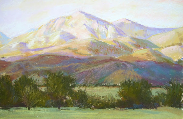
Mountain Snow, 8" x 11"
Photographic prints, especially those taken by amateur photographers, often validate oversimplification and lead the student artist astray. Because cameras average the light coming into the lens, in all but the most expert of hands a print will be overly dark in dark areas or overly light in light areas. All detail and nuance of color is lost in the shadows or washed away by the light. Spend time observing the values and colors of snow without relying on a photograph to portray it for you. As you step outside on a cold, snowy day you might first notice the whiteness of the snow, and then perhaps the color of the sky. Spend time looking for the subtleties of color in the snow. Generally you will see warm colors in the sunlight and cool colors in shadows. When the light is one color the shadows are usually the opposite, but the color depends on many variables. Remember aerial perspective holds true. Distance flavors all colors, strewing the light around the landscape so that colors become lighter in value and cooler in color as they recede from the viewer in all instances -- except that of white. As white recedes it becomes slightly darker and duller. It remains its whitest in the near foreground.

Sunlit Snow, 12" x 12" (underdrawing, charcoal)
Shadows on snow will shift with distance, generally from greenish-blue in the fore to lavender-blue in the middle ground to pure blue in the distance, as the air progressively filters out yellow and red. Shadow colors on snow often depend on the color of the sky. Look for a shadow crossing new-fallen snow. See how the sky color is captured there, dark beneath its source and lightening slightly with distance. Snow is extremely reflective. Because it’s light in color (literally containing all colors in white light), snow reflects a greater percentage of light. Consider a snow-covered hillside that forms a soft bowl at its foot. Depending on which way it faces, the shadowed face may contain subtly different colors because the sky reflected in it will vary slightly. The sky is somewhat darker at the zenith and paler at the horizon, as well as slightly warmer in the quadrant near the sun and cooler away from the sun. This means that the colors in shadows on snow may be some permutation of warm or cool, very pale or somewhat darker, and range in color from blue-green to lavender to pure blue depending on the distance from the viewer. This allows for exciting color possibilities in both sunlight and shadows on snow. Reflections in snow can also be found in more intimate surroundings. Look for the color of a wall or fence reflected against the snow bank beneath it. Bounce colors from nearby objects into the shadows, thereby creating particularly beautiful temperature changes. A reflection can season the color of the shadow nearby, causing another dimension of color in the snow. Layering colors creates subtle variations, particularly in deep shadow areas. Even the darkest shadows in snow are fairly light in value.

After a heavy snowfall, the outlines of objects become muffled and soft, blanketed with a thick, velvety whiteness that blunts hard edges. The barn becomes a giant pillow pointing its corner skyward, the car a marshmallow shape in the hollow of the driveway. Trees become weighed down by the wetness of the snow. Look for the way the branches are pushed down until the snow atop them becomes part of the bank beneath. Don’t miss the heaviness of snow. Also, find places where the rich, dark soil punctuates the snow as it begins to melt, forming deep pools around plants and grasses. Concentrate on these edges, which are crisp where they touch the ground but remain rounded above. Be especially careful in places where dark colors reside in front of light ones, and must therefore be painted dark over light. It’s best not to overwork these spots, which is bound to cause muddy-looking patches. Plan your painting carefully so that you can use one deliberate stroke of color, then stop while it’s fresh.

A snow drift is an exercise in hard and soft, sharp edges and blended slopes. Find the direction of the sun and the defining shadow. Without any shadow, drifts are seen as subtle variations of warm and cool. Look for the crisp line along the top edge and the soft slide of snow, like a mountain in miniature. See how you can define this slope using colors that are layered and softly blended together to create the shadow side, adding a line of light color where the sun blazes. If there is a cornice where the snow has blown over the top and frozen in place or a cast shadow crossing the drift, you have an added chance to define the shape of the drift with color, blending and edges.
Winter Sun and Shadows, 12" x 18"
Although there are generalizations that can assist you in painting snow, hard and fast rules need to be suspended. The reflective brightness of snow changes everything. So be adventurous, try new colors, layers and new techniques. Painting snow with pastels is a very satisfying experience. Snow is light in color and value, the strongest range of colors available in the medium. Pastelists therefore have virtually endless choices of colors to use. Snow’s rounded softness is easily captured by lightly blending colors to show the swish and slide of shadows. The reflective qualities of pastel mimic the sparkle and shine of snow with ease. All in all, pastel is well suited to painting snow.

FALLING SNOW

There are different techniques you can use to paint falling snowflakes, but it’s best to paint the entire image before adding any falling flakes. Choose a subject with muted light since snow falls from clouds that obscure the light. It’s not necessary to have a photograph of snow falling on the scene you’re painting since photos are hard to capture, but study such photos for evidence of how to make snow look realistic.

For instance, there will not be any strong shadows in the photo, nor will there be strong dark and light contrasts. Paint the softly muted colors that come from low ambient light. Use a palette of subdued light to medium-light colors, with an occasional dark to punctuate the painting. Remember that in a high-key painting with low contrast darks become very strong punctuation. Carefully place these darks to draw the eye. Because the light is low, your lightest colors will not be strongly white in color, so reserve the use of white for the end, assuring yourself that you’ll have lights to use if needed. Many paintings of falling snow will have no pure white in them at all. Put your white aside for the majority of the painting.

Notice how falling snow looks in a photograph. There are near and far flakes seen in varying degrees of light colors, the nearer ones bigger and brighter. The pattern of flakes is random and swirling, not evenly spaced like wallpaper. The flakes may look light against darker areas and sometimes darker against the whiter areas -- but not always. At times the light flakes simply disappear against the lightest areas of the painting. You don’t have to show every flake. Less is often more!

To make the final falling flakes choose several colors in various light and medium-light shades. Begin by dotting in a few key spots to draw the eye, adding colors judiciously. Notice the angle at which the flakes are falling. Sometimes the wind whips them into swirls, although there’s usually a prevailing direction. Stop after each layer of dots, making sure to vary the sizes and colors to create the illusion of depth. Do not allow all of the dots to be uniform in shape. Fat flakes may be oddly lumpy. Small flakes may appear as short dashes. If you make the mistake of painting every falling flake as a dash of the same length and color it will end up looking like pouring rain. Take care to see how the pattern of flakes draws the eye -- and remember, it’s easier to put a few more in than take them out! If you make a mistake and feel the falling flakes must be changed, you’ll be forced to wipe out quite a bit of your painting.

You may try using white spray paint to make snow. Carefully drift the spray over your finished painting. Be cautious, however, as once it’s there any changes you try to make will be obvious and usually unsuccessful. Perhaps a more effective means to make incidental snowflakes is to use a razor blade to shave off bits of pale-colored pastel onto the surface of your finished painting, laid flat on a tabletop. A second pass can be done with a very light drift of pure white pastel to simulate the nearest and brightest snowflakes. When the results please you, place a piece of clean newsprint over the top of the finished painting and briskly rub the flat of your hand over it to burnish the bits into the paper.

Cold Blue, 9" x 12"


Last Snow, 9" x 12"

Thursday, February 9, 2012

CHAPTER THIRTEEN -- FOREGROUNDS


Sunstruck City, 9" x 17"

Foregrounds can present a particular problem to many painters, regardless of what is painted there. This critical area can trouble professional artists and students alike. The foreground must function to support the subject of the painting and not distract the viewer’s eye.

Nothing distracts more than a weak, disruptive composition that allows the eye to meander, fixing on nothing and going nowhere. Instead, a strong foreground will lead clearly and succinctly to the focus of the painting, with enough detail to enhance that subject. A weak foreground can destroy the effectiveness of a painting that is otherwise successful. No matter how strong or visually delightful the center of interest, if attractive elements in the ground plane lead the eye away from it, the painting becomes disjointed and uninteresting. If, on the other hand, the ground plane is a bland sea of useless, rambling details, or is so devoid of information as to be visually boring, this area simply fails to do its job.

The fore is often the place where distractions occur. Because the greatest color, contrast and detail reside at your feet, it is necessary to walk a fine line between enough and too much if your center of interest does not reside there. Excessive detail can overburden the senses, heightened darks and lights may attract unwanted attention and strong color might appeal to the eye when it is not meant to be the center of interest. The solution is to take into consideration this key area and arrange the various components in the fore to direct the viewer’s eye, moving it quickly or slowing it momentarily, or perhaps allowing it to rest briefly in an area of quiet calm before moving on. The rhythm and syncopation of this movement is important and allows you to vary the tempo, pace and direction the eye moves.

Think about how you can use the fore to guide the viewer’s attention to the focal area (it may not be just a focal point but a grouping of items) and keep it comfortably centered there. Allow your viewer to arrive at the focal area, providing a visual pathway of some sort. This might be as simple as a trail of light that leads the eye through the foreground, or it could be as obvious as a paved highway with a yellow stripe curving across the land, pointing like an arrow to the center of interest.

It is sometimes tempting to minimize any foreground, cropping the image so that the offending or difficult part is simply cut out. This can often leave the subject sitting directly on the “windowsill” of the painting with no room to travel visually to the subject. While cropping might seem a simple solution, it actually contains pitfalls of its own since the need for excellent composition is often then increased. Instead of cutting out the offending portion, consider utilizing the space to strengthen the painting. The abrupt quality of the painting that is merely a subject and background, with no intervening sense of space, can be confusing. While this composition may be effective and interesting when done by a master painter, it’s not a solution you can rely on for every painting.

Far more often you want to use shapes to give mood and movement to the work, making the foreground a vitally important and motivating part of the composition, an appealing and lively portion that does not distract. Compose with two key ideas in mind: Create depth and keep the movement operative.

There are many elements you can include in the foreground plane to create distance and movement. Consider including a vertical element such as a tree or bush, telephone pole or fence to enhance the illusion of distance. When a vertical object protrudes into the more distant planes above, it functions much like a puzzle piece, locking the composition together in relation to the foreground.

Indigo Mesa, 12x9”
A streak of light and the shadow it casts can draw the eye and change the direction it moves. Overlapping grasses and bushes, large and small, can make a soft transition. Strongly contrasting colors or values, such as a patch of snow or brightly colored flowers, can entice the viewer. A change in plane where the ground rises or falls away can move the eye swiftly or slowly in another direction. Lost and found edges become important in pointing the eye, making a soft or abrupt shift.

Strong verticals create upward or downward movement and horizontals move the eye side to side, while angles can provide transitions between them. The place where these directional elements intersect can be critical. Pay close attention to the X or Y where they meet and maintain the movement in the proper direction.

Be sure to use patterning. Look for the repeated overlapping colors and characteristic shapes found on the ground, such as low-growing grasses, small bushes, flowers, weeds and dirt.

Rather than laboring to paint every detail of grass and leaf, use repeated patterns that are somewhat larger in the immediate fore and become progressively smaller. In the distance these strokes, laid down like tweed cloth with dashes of characteristic color, create a simple texture with muted color that explains enough without saying too much. Oftentimes patterning is the key to solving foreground dilemmas simply because it creates an illusion or suggestion of detail without becoming disruptive.

Keep in mind that the slight graying or bluing of aerial perspective is needed to add to the illusion of depth. The colors in the immediate foreground will be the most saturated, yet there will be times when you must mute them slightly so that they do not compete too much with your focal point.

Conversely, injecting strong color into the foreground can enhance perspective. Remember that as colors recede from the eye there is a color shift as increasing layers of air filter out first yellow and then red. This means that as you look out over a large field those grasses at your feet will have all of the combinations of red, yellow and blue in them, as well as holding the strongest contrasts of dark and light. As the grasses recede into the mid-distance they will first become somewhat less yellow, leaving mixtures of red and blue, resulting in a lavender hue. If the field is large enough, red will slowly be filtered out in the great distance, leaving a pale blueness to the grasses farthest away. (See CHAPTER FIVE -- AERIAL PERSPECITVE)

In fact, at its simplest, the landscape could be expressed according to the rules of aerial perspective as the yellow of the foreground, the lavender of the mountains and the blue of the sky. This formula actually works quite well to express minimally the land and sky.

La Madera, 9x12”
A few ways to break up a foreground include:

• a fence line

• a vertical bush or tree

• overlapping grasses and bushes

• a change in plane

• rocks

• shadows

• a streak of light

• contrasting colors or values

• a reflection in a puddle

• patches of snow

• a road or pathway

• a river or stream

• other interesting shapes or colors

• many other devices

Don't let your foreground be so empty that it looks unresolved. Suggest things, even if you don’t describe them. Don’t be unwilling to add elements to the foreground to move the eye, recomposing to strengthen the painting.

Rim Light, 12x18”

Thursday, February 16, 2012

CHAPTER SIX -- MOUNTAINS

(Originally published in The Pastel Journal)

Massive mountains loom on the horizon, a pale purple-blue backdrop to the hills and fields before them. Although they’re still thirty miles away, the jagged peaks are vividly etched against the soft blue sky. Shadows flow across the slopes, defining the repeated folds, a ray of light picking out the blue-green of a distant hillside. Mountains define the western skyline, rising from the high plains to altitudes so high that the uppermost reaches can be decorated with snow year-round. These giants set the stage for the drama of the West.

Mountains can pose some unique challenges to the artist. Doing a complete study so that you come to better understand the unique aspects of these massive ranges allows you to resolve such issues as scale, form, value and detail. This can be done as a separate sketch or as an underdrawing.

Charcoal underdrawing
The issue of scale is often the toughest to sort out. The inexperienced artist sometimes decides that in order to show the massive mountains she should try to fill the entire picture plane with nothing else. Mountains crowd the scene, with very little sky or foreground, but become oddly dwarfed by the context, or the lack of context, of the painting. Instead of massive crags, these appear to be mere hills. This is in part because surrounding elements serve to show the grandeur of the peaks. In a framework of sky and foreground, relative scale becomes apparent. Without elements to compare to the mountains, the viewer has no grasp of their size and will often assume they’re far smaller. Including clouds above or trees and grass in front, or both, gives the viewer a comparison by which to grasp the scale.

It’s best to have a good understanding of the form of the mountains you’re painting. Form, of course, is the three-dimensionality of an item. It shows depth, as well as height and length, making a triangle into a pyramid. In the case of mountains, the ways that peaks and valleys interplay -- close and far, large and small -- as well as the light and shadow that indicate these factors, add to the form. As you lay out the composition you’ll usually begin to perceive these forms in greater detail.

It’s a good idea to think about how the mountains you’re painting were fashioned over time. In the West, tectonic forces have thrust up the mountains, and continue to do so as continental plates slowly converge and slide atop one another. This seismic shift, which creates some of the largest mountains in the world, often results in a softer slope on the side of the range where the plate has been lifted. These more gradual slopes are gentler and often covered with trees. On the opposite face of the range the edge of the plate is exposed as it has been thrust into the air, creating sheer, sharp outcrops and crumbling rock faces. This exposed edge may reveal striations in many rich and subtle hues of gold, orange, red and purple running along the course of the range. Look for those places where a particular kind and color of rock takes up farther along the chain, repeated at similar altitudes, though often angled downward from the axis of the break.

Mountains are subject to the erosion caused by wind and rain, which wears away softer types of rock, leaving harder rock exposed. The granite faces of Pike’s Peak in Colorado have outlasted surrounding rocks unable to withstand eons of erosion. Often granite can take on a particular pinkish color, giving a fiery glow to mountains such as the Sangre de Christo (Blood of Christ) range in New Mexico, named for the almost blood red color these peaks become at sunset.

Dry and Cool, 12” x 18”

Occasionally an area of the earth’s crust will be thrust up into a large dome shape but because the seismic forces are somewhat less severe the crust does not crack and split apart. This results in softer rolling ranges such as the Black Hills of South Dakota, which can include extremely colorful rock layers that remain at remarkably similar altitudes. Again, look for ridges of rock linking neighboring mountains with their stripes of color.

Sometimes as the huge blocks of the earth's crust are tilted upward or are completely turned over by tectonic shifts, they push up along a fracture line or fault, resulting in ranges such as the Sierra Nevada in California. These chains have piles of loose rock deposited at the base by the scraping motion of the movement that created them, and often have a rough, jagged line of peaks, such as those characteristic of the Grand Tetons in Wyoming, or other areas where spectacular rock outcroppings occur.

When you paint recognizable mountain ranges -- those that have identifiable shapes such as the bold geometry of Half Dome or the Tetons’ toothy skyline -- it’s best to include characteristic natural elements and indigenous vegetation in the foreground. In other words, don’t put a saguaro cactus into the high regions of the Tetons, no matter how much you need a vertical element.

Often when the artist begins a detailed underdrawing of the peaks and valleys found in a mountain range she finds that she cannot tell what lies in front or behind, whether the mountainside continues to descend or begins to rise in one particular place. Rather than becoming blocked by this, unable to go on with the drawing, she must take matters into her own hands and simply decide. Unless you’re painting an extremely detailed exploration of every peak, no one but mountain climbers will argue with you. However, when you’re painting an identifiable and familiar mountain chain, be sure to conform relatively closely to the specific shapes and spacing of the crests.

South View, Placitas, 18x24”

Due to the effects of aerial perspective, certain elements begin to change as mountains recede toward the horizon. First, and most noticeable, everything becomes cooler in color and lighter in value. The intensity of warm colors fades. Detail is slowly lost, edges soften and the contrast in value diminishes. In his book Carlson’s Guide to Landscape Painting, written in 1929, respected art instructor John Carlson explains that as one looks sideways through the progressively thickening atmosphere it’s as though there were curtains of air hanging at regular intervals, like veils through which you see. Another way to picture this is to think of one-square-mile blocks of slightly bluish air stacked sideways and upward, filling the distance. The farther away an object is, the more blocks you must look through and the paler and bluer things become, until the most distant range of giant mountains is reduced to a mere line that’s nearly sky blue. Leonardo da Vinci, the consummate eyewitness of physical effects, noted this bluing of objects with increased distance. In the 1500s he observed that if an object “is to be five times as distant, make it five times bluer.” His advice still applies today. The only exception to this visual rule is white. In the distance white becomes slightly dull and warm, a pale pink or yellow. Distant snow isn’t the same bright white as that in the foreground. Clouds atop far peaks are somewhat yellowed by distance, enhanced by pollution. The values of all colors become paler in the distance. For instance, although you know that the mountains in the distance are made of the same rock, with the same trees, bushes and meadow grasses as those closer to you, the values appear muted and grayer. Test this by squinting your eyes so that the distracting color fades away.

When painting mountains, begin by carefully selecting the proper value for the entire mass, and then delineate the slight differences in value seen in each range, adhering closely to the original value mass unless there’s a great jump in distance. It’s very easy to fall into a little trap when painting mountains. The general value of mountains is medium-dark, which means they’re not as light as the sky or as dark as the trees, and are slightly darker than the medium-light of the ground. However, as you paint downward from the sky, you usually encounter the mountains next, and have no basis to compare values. This means that until you establish the value over the entire piece you cannot adequately decide the correct value of the mountains. They almost always seem to be too dark at first, but are easily lightened in pastels. Additionally, while we generally assign mountains a medium-dark value, this usually refers to the tree-covered lower slopes. In fact, the rocky faces of the high mountains of the west are often a medium value due to the color of the exposed rock, sheer cliff faces and the lack of trees.

No matter what the conditions, whether seen through the warm, hazy light of summer or the still clearness of a cold winter day, whether high and clear or viewed from lower altitudes, mountains form the breathtaking backdrop to so much of the western landscape. You can meet the challenge using careful observation and soon master the colors and values of the irresistibly beautiful mountains.


Silverton Summer, 9x12”

All of the paintings shown are available (subject to prior sale.)

Wednesday, February 15, 2012

CHAPTER SEVEN--THE SKY

The sky is the key to the landscape. It determines the quality and quantity of the light, the color unity and the value contrast of your painting. Most landscape painters begin with the sky for these reasons.
When painting the sky, remember that it’s the lightest value in the picture. Carefully analyze the value of the sky, perhaps using a red filter. It contains the sun -- the source of the light -- and clouds, which are light in value and color.
Desert Morning, 12 x 9"
Now analyze the color. Look at the quadrant of the sky containing the sun and compare the color there to the exact opposite quadrant. Notice that it's warmer in color and slightly lighter. Ask yourself what color the other two quadrants are, as well. The sky progresses from a warmer blue to a slightly cooler color, depending on the direction you're facing.


Depending on where you live, the value of the sky may be lighter or darker than you think. Our beautiful bright blue skies in New Mexico, or any high and dry climate area, can appear to be very dark, but you shouldn’t let your blue become a gloomy color. Keep it light and airy. Conversely, in more humid, lower climes the sky may appear to be quite light in color, but you shouldn’t over-lighten it too much. Make your skies colorful, controlling the value.


Summer Heat, 9x12"

Even when we know this, we sometimes need to be reminded of it: The blue of the sky is deepest at the zenith and lightens at the horizon. This knowledge can help to create the effect of the giant blue bowl of the sky looming overhead, darkest at its highest point. The atmosphere around our planet when seen from space proves to be a fragile layer no thicker than an eggshell, speaking proportionally. The darkness of the zenith of the sky is essentially the black void of space seen through a thin blue shell of air. As we rise higher in altitude, even less of this blue atmospheric layer colors the sky, so that you see more of the darkness of space through less of the air. In arid areas the atmosphere contains less water vapor, making for clear, bright skies. In humid parts of the world the increased water vapor, which is less transparent, causes the sky to be a milky, paler blue. At lower altitudes the sky is paler in color because there’s actually more air to look through before reaching the black of space. At higher altitudes the thinner air makes for brighter, intensely blue skies. Think of the difference between the panorama you see standing on the top of a peak in the desert southwest, where the air is thin and dry, and the view from a bluff above the ocean looking out to sea. Both may be dramatic and beautiful, but high dry air gives a longer view than does thick humid air.

When painting skies around my home I like to use a mixture of blue-violet and blue-green to create the color of the sky. I’ve observed that summer skies seem to lean toward turquoise while winter skies are more violet. However, I urge you to observe for yourself and analyze whether this is true. Such a benchmark may be helpful in choosing whether to layer blues that lean a bit more toward green or violet.

Last Snow, 9x12"
As strange as it seems, the sky will appear to be not so light on a bright sunny day. The reason is that the sunlight flooding onto it raises the value of the land plane. The difference between the land and sky values is less than when clouds add highly contrasting shadows. A gray-day sky is lighter in value than a clear-day sky because the clouds catch and hold the light, much as does milk glass, making it brilliant, almost glaring, compared to the clear glass effect of a cloudless day.

Friday, December 16, 2011

Thanks...

I just wanted to post my gratitude for the many well wishes and thanks I've received for the book. 

It was a "labor of love", first from the standpoint of one who loves this vibrant and lively medium, and loves teaching others a few of the things I've learned about how to paint the landscape, but mostly out of love for Christ, who gave me a modicum of talent and provided me with the opportunities to explore and enjoy using pastels. It was His example that showed me so clearly that I wasn't to hold out, hold back or expect to gain income from the book, but that in giving it away I would gain more than I could ever expect otherwise. The truth of that is difficult to prove, but it's real nonetheless. Your thanks are truly appreciated.

Although due to family needs I have few chances to spend time in my pastel studio, I continue to teach classes once a week with a devoted group of students, and I pursue painting in gouache on my little dining room table. My mind roves over the landscape and technical areas I haven't yet explored in this book, and as a result I have several additional chapters brewing. I sincerely hope to write them and post them here as an appendix, of sorts.

If you have a question or idea you would like answered, or would like to propose an additional area of study in the landscape as its painted in pastels, I welcome your thoughts. Please understand that for the present I'm not in the process of writing, but as I teach and post on Today's Art Class blog, much of what I hope to write is beginning to coalesce.

And in the nearer future, I hope to begin offering online workshops in the landscape in pastel. Look for that to come to fruition in 2011 sometime. I'll post opportunities here as they arise, but if it's something you're interested in doing and you have a particular subject you'd like to explore (i.e. sunsets, reflections, snow, night, etc.) send an email to me at d.d.secor(at)gmail(dot)com and I'll add you to my mailing list.

If this is your first visit here, please page through the Table of Contents Links in the sidebar. If you're new to pastels, you might want to start at the beginning and explore the possibilities in order. Perhaps you're struggling with a particular subject and stumbled upon the information using an Internet search. Either way, I hope what you find here is of help and interest to you.  

Every student is a blessing to me. Teaching is a delight, and freely sharing even more so.
Deborah