Sunday, October 9, 2016

PDF/ eBook Format

Since I first shared Landscape Painting in Pastels as a blog, I've had people ask me to offer it as an PDF they can read or print. Finally it's here for you. Just click on the link below:

Landscape Painting in Pastels PDF

If you want to print the book, open the PDF, right click, choose print and away you go. It's 142 pages. I really hope many of you will find this helpful.

Or you can also go to www.bloxp.com and make a nice little eBook, which you can save in any or all of three different formats. Free. Clean, easy to read, ready to go on your Kindle, if you like. I recommend you add a Table of Contents, and delete all the posts after The End. It's easy and quick.

I humbly apologize to those of you who have already laboriously copied and pasted page after page, and printed them out for yourselves.

I'm afraid the rest of this post is only going to make sense to Christians.

We crazy-seeming Christians have some odd values, but we live in an upside-down world. If knowing you can have the PDF version of the book is all that matters to you, let me just wish you well. I hope you'll enjoy this format. Feel free to print out one copy for yourself, if you want one. Blessings to you...

If you're staying with me, I have to confess something here. I've been reluctant to push the buttons to make this happen because I haven't really been giving this book away with the heart of joy that God wants us Christians to have.
But this I say: He who sows sparingly will also reap sparingly, and he who sows bountifully will also reap bountifully. So let each one give as he purposes in his heart, not grudgingly or of necessity; for God loves a cheerful giver(2 Corinthians 9:6-7)
I have sowed rather sparingly, grudgingly giving this book out of necessity.

I wrote this as my 'retirement income', fully intending to approach publishers and envisioning it as the way I could take care of myself when I retired. If you aren't a Christ follower, the fact that I chose to give it away might not make a lick of sense to you, but those of you who know the Lord probably get it. This isn't a do-it-yourself life, it's a life of dependence on the Lord.
Trust in the Lord with all your heart, And lean not on your own understanding; In all your ways acknowledge Him, And He shall direct your paths. (Proverbs 3:5-6)
I was led to believe that the best thing I could do was to find a way to give this book away, freely and completely. If I hadn't been certain that the Lord Jesus was directing me to trust Him in this, I never would have done it. He surely doesn't intend that everyone do this same thing, but He made it clear to me. Maybe you've had this same kind of certainty about something else.

After hesitating for about two years, I capitulated, knowing that when I surrender to His will things always go better for me. Yet, as I said, I gave with a grudging heart.

I know that when I draw near to God, He will always draw near to me (James 4:8), so recently I started digging into the dark corners to find out why I just haven't had much joy. I realized I was obeying Him but not responding to His grace. I wrote "Freely you have received, freely give," but I held back a little.

Jesus has so graciously let me find my way to this issue over the course of six years, but now the Lord wants me to GIVE this book. Fully. And I do.

Today I came to the realization that I could invest cheerfully in giving more by figuring out how to make a PDF file you can access and print. I'm so glad to be able to do this and I hope the format works. Look into www.bloxp.com or any other platform you want to use for making a blog into an eBook.

May the Lord bless you as you use this book. I hope it brings you JOY!

Deborah

Thursday, February 23, 2012

LANDSCAPE PAINTING IN PASTELS- acknowledgements and copyright information

Copyright 2010 © by Deborah Secor. All rights reserved. 
Originally published online on 2-10-2010. 

Information may be downloaded for personal use; users are forbidden to reproduce, republish, redistribute, or resell any materials from this weblog in either machine-readable form or any other form without specific written permission of the author. For permissions and other copyright-related questions, please email: debsecor (at) gmail (dot) com 

Please see further information on COPYRIGHT and MAKING COPIES  in the left column. 

________________________________
LANDSCAPE PAINTING IN PASTELS
By Deborah Secor


________________________________
DEDICATION

To my Lord and King, Jesus Christ.
You sustain me in all things.
To You be all the glory and honor.

________________________________
ACKNOWLEDGEMENTS

I would like to thank Maggie Price for her help in conceiving and executing this as a workbook beginning back in 1993, and for encouraging and fostering my writing ability. I learned tremendous amounts writing under your guidance for the first five years of The Pastel Journal’s existence, and I’m so grateful for the opportunity you first gave me to begin writing professionally.

F+W Publications originally published several of these chapters as articles featured in The Pastel Journal, although many of them have since been further edited as I’ve discovered more about the subjects. I especially want to thank editors Maureen Bloomfield and Anne Hevener, each of whom has helped me along the way, as well as the entire staff of editors that have consistently corrected and improved on what I've written. Many thanks to Philip Van Hulle for editing these pages. I’ve learned over the years that a good editor works hard to make the author look better than she is.

The people who have passed through my classrooms for over 20 years have acted as the catalyst for this book, constantly seeking to understand more, consistently asking excellent and engaging questions that required me to find the bottom line, and providing the enjoyment of watching them journey along the pastel pathway. I meant it every time I said, “It’s looking good. Keep going!”

A special thanks to my Thursday art gang who have kept coming back for many years of fun, work and growth. Some have come and gone, but you all know who you are. It’s a privilege to teach such a talented group. I couldn’t do it without you. You always make me look good!

Wednesday, February 22, 2012

INTRODUCTION

You will write this book. Oh yes, it contains my thoughts and knowledge, but I think you’ll find that the insights and affirmations that you note here will be of greater value and stay with you much longer than anything I say. I hope it helps you to record your revelations and keep then in one place where you can analyze and add to them over the course of your studies. Use it to hold your notes or slide in a few sketches, and get it dirty as you page through with pastel covered hands. Let it inspire you. This is not meant to be a treasure to hide on the shelf—it’s supposed to be well used as you work, applying the principles you find within.

As you use the book, please keep in mind that what I offer are general rules to help you better deal with the exceptions when they arise. By knowing what is as a rule true you may approach painting from a position of strength, utilizing skills rather than simply creating a happy accident. Those accidents may be fun but there’s nothing more frustrating than achieving a success and not being able to recreate it for lack of understanding.

Originally this book was conceived of as simply copies of my notes for the use of my students. It grew in concept to include illustrations, advice, and, I hope, inspiration. In this third edition I’ve tried to include more about each of the subjects demonstrated in my classes, as well as including new subject matter. You’ll also find a bit more of my personal beliefs and viewpoints on art and life flavoring things, and I hope stimulating your thoughts.

I’ve been blessed to be able to teach so many talented and willing students over the years. I find most of them have come into the classroom looking for information, inspiration, encouragement and companionship. Making art can be solitary and sometimes lonely, especially when we become too self-involved. Art is communication, at essence, so I believe the path should be a mutual experience, as well.

You were given an ability to see that can be enhanced using tools. In order to see better you might put on glasses; to see significantly more you use binoculars, a microscope or magnifying glass. Likewise you have a measure of artistic talent, which is simply the weight of ability given to you, but you want to develop that ability. I hope this book becomes a valuable tool to help you to see even more.

Knowledge needs to be exercised almost daily. It’s the everyday use of it that hones it into wisdom, since it’s through both repeated failure and success that we learn what works. Artistic tools are the exciting observations, technical applications, and repeatable ‘recipes’ that result in the means to make art. I hope what you find here is not merely formulaic but shares with you the pathway I’ve been on for some thirty years, helping you find the way to get started or to continue your studies, adding some local color along the way, and in the end, I hope, aiding you as you forge a trail of your own.

~Deborah (2010)

-*-*-*-*-*-*-

A GIFT

I contemplated selling this book, but in the final analysis I decided that it was better to give. Jesus tells us, "Freely you have received, freely give." So I will. I hope you enjoy and benefit from it.

I'm a Christian, a Jesus follower. He gave His life away for the greatest reason possible: so everyone could understand that we can have eternal life. As a follower, I give my life away freely, too, though not like He did (since I'm obviously not God.) My firm belief is that...God showed his great love for us by sending Christ to die for us while we were still sinners....For the wages of sin is death, but the free gift of God is eternal life through Christ Jesus our Lord.

A disciple becomes like the one she follows, and one day I realized that about the neatest way I could give my 'life' away was to give this book away to anyone who wanted to read it! But I couldn't afford to print it and send it out, so doing it online was the best way--on a blog it could be freely given. Jesus said, "Wherever your treasure is, there the desires of your heart will also be." Heart follows treasure... My treasure is Jesus!

With my blessings,
~Deborah

Maybe you know that God loves you, but you also realize that you’ve done things that are wrong—you’ve sinned. That sin separates you from God. Out of His great love He sent His only Son, Jesus Christ, to die as the sacrifice to pay for your sins. His resurrection is the ultimate evidence of eternal life. When you recognize your need and want to begin to live as a new creation, you can ask Jesus to be your Savior and Lord in prayer. There's no hocus-pocus here, just the reality of faith and new life in Christ. That is the real gift here!

Tuesday, February 21, 2012

CHAPTER ONE—PASTELS AND OTHER MATERIALS

PASTELS

Pastels are pure, dry pigments mixed with a binder to form the familiar sticks. However, anyone who refers to pastels as chalk will be drummed out of the local pastel society! Why? We’ve worked long and hard to educate the public, explaining these differences: chalk is made of dyed limestone (now mostly gypsum), while pastels are the same pigments used to make familiar paints like watercolors and oils. Usually the sticks are made by combining these powdered pigments and a binder, most often gum tragacanth, rolled into sticks and left to dry. If you look at a particle of pastel under a microscope you’ll see that it has a crystal structure that reflects light in its color. This is why the medium has such clarity and brilliance of color. When I say “pastel,” I’m referring to soft pastels (not oil pastels), but under the soft pastel heading is a range of hardness depending on the ratio of binder to pigment. NuPastels are hard, Rembrandts are medium and Schminckes are soft, but all of them are called “soft pastels.” NuPastels have more binder than pigment, while Schminckes have more pigment than binder. You’ll find a ratio here: as the softness increases the cost usually rises. Pigments are more costly than binders.

Many people ask my favorite pastel brand, and I have to say that I really don’t have one favorite. However, I favor very soft pastels and generally use them in my personal work from start to finish, with only occasional forays into medium-soft brands. I generally use sanded papers and boards that provide deep tooth, resulting in a creamy, thick painterly look to the pastel application. This is my choice of technique and shouldn’t be construed as the only way to do it. In the classroom I’m far more interested in the student finding the materials that will work best for her chosen mode of expression.

For those just starting on the pastel journey I offer a caution: Pastelists are commonly heard to cry, “I need more colors!” In fact, I’ve had students complete an eight-week course of classes with a selection of only sixteen colors and learn a tremendous amount about creating various colors and controlling values by overlapping layers of colors, but I assure you that at the end of the class they invested in more pastels. The habit can become almost addictive. Because at this writing there are more than 5,500 individual color sticks available on the market (according to Multi-Brand Color Chart of Pastels, Huechroval, 2008), with more arriving all the time, it seems the cry will continue to be heard. If you find yourself becoming intoxicated with this versatile medium the chances are you’ll say it, too.

If you’re new to pastels I recommend purchasing two sets, one somewhat harder, and one much softer. The advantage to this is twofold. First, you’ll find the harder pastels more inexpensive, but you must have some softer brands in order to understand how differently they cover the paper. Second, you’ll find that working soft over hard pastels is a time-tested method that may give you more comfort as you move from thinking of the medium as one of drawing into one of painting. Don’t think that you can buy a medium-hard pastel set to do it all -- it simply doesn’t work that way. Shop around to find the best buy, which will often be found online at one of the large catalog stores, but in the end I believe you’ll benefit from trying different kinds of pastels to find the quality that works best for you.

My usual recommendation is a large set of relatively inexpensive harder pastels, such as NuPastels, and a somewhat more modest-sized set of very soft pastels, such as Great American. (I offer a hand-selected set of colors through Great American that many students working in the southwestern United States have found useful.) However, keep in mind that there’s a dizzying array of brands from which to choose. Whenever possible, purchase a few sticks of each of the brands that are available from open stock at your local art supply store before buying a larger set, or look into purchasing such a “sampler” from an online retailer. That way you can experiment to find out how they feel, plus you can apply them to all kinds of pastel painting surfaces to see what appeals most to you.

PAPERS AND BOARDS
There are two key features that pastel painting surfaces have: tooth and texture. The best test you can use to determine the texture or tooth is the hand. You need to feel the surface to see if it’s fine-grained and machine smooth, rough and scumbled, or deep, soft and velvety.

Tooth generally refers to a coating added as a surface treatment to a substrate, whether it’s made by a manufacturer and sprayed on in a factory or mixed up in your studio sink and painted on your paper or board. Texture is generally patterned into the paper itself. It usually refers to the weave or other regular marks left on the surface of the paper that will show up more clearly when pastel is stroked across it. The pulp of the paper may be apparent, resulting in a slightly striated, bumpy or screened surface. Some of these papers have a laid surface, which is a patterned texture of parallel lines impressed in each sheet. Texture doesn’t have as much depth as tooth and won’t hold as much pastel in place, sometimes requiring a fixative or other finish to stabilize the pastel.

Canson Mi-Tientes is often the first paper people try, if only because it’s commonly available, inexpensive and comes in a beautiful range of colors. It’s lightweight and easily handled, and invites a drawing technique in particular. It has a nice woven textural quality that resembles the look of canvas. However, because it has little tooth it’s not suited for use with the softest of pastels, which may quickly become muddy in inexperienced hands. Instead, most artists prefer to use a slightly harder pastel on Canson.

Sandpapers are usually made on a backing sheet of some kind, covered with a coating that contains pumice, sand, marble dust or other silicates that provide the irregularity needed to hold pastel in place. For instance, sandpapers are generally fine-textured and rather smooth to the touch, but have deep tooth. You can easily work with both hard and soft pastel brands on sandpapers, which customarily hold many layers of pastels. One excellent advantage is that sandpapers can be erased and reworked to some degree. Another thing to keep in mind about painting on any of the sandpapers is that very soft pastels fill the grain of the tooth rather quickly. This does not mean they’re inappropriate to use on that surface, just that you might want to use a light hand in applying the softer pastels so that they’re not needlessly wasted.

In my classroom I recommend using Wallis Professional grade sandpaper, which I use about 90 percent of the time in my studio. It’s a wonderful, versatile surface that has very few limitations. It has the tooth necessary to hold the little pastel crystals in place and accepts many layers of pastels without filling up and shedding pastel. It has a nicely machined surface texture and the bright white color can be easily toned to any color you desire. I suggest beginning students try Wallis sandpaper first. (See the chapter on Surfaces and Effects for more information.)

GADGETS
Suppliers are always coming up with new products for pastelists, but some of the most innovative and useful tools around are called Colour Shapers. These gadgets have a handle like that of a fine brush, but rather than being tipped with bristles they have a soft silicone point (a rubber tip, most of us say) that can be used to move pastel pigment around much the way your finger does. How many times have you wished that your finger were small enough to reach into a little corner? Using one of these, it is. Colour Shapers come in soft and firm grades for different effects, as well as five different shapes and sizes. Use them to grab the pastel and move it around much the way you use brushes to move paint. Enjoy the way you can soften and blend edges and colors or add definition with the side. I suggest you buy the flat chisel shape, but be aware that the square corners will slowly become rounded as you use it. The tips wipe clean easily so that you don’t contaminate colors.

Another innovation are the Sofft® tools, which are dense foam pads in various shapes that you can use to move and blend pastel. I use the larger round, flat ones to mass and smooth transitions, or remove a light layer of color when needed. The wedge-shaped and squared tools are useful to grab and transplant a long line of color from one spot to another, or to create grassy strokes.

I often use a plain white plastic eraser for many effects, too. It’s very handy on the Wallis paper, where I use it to erase areas in the tone, restoring the bright white of the paper, as well as to literally erase mistakes. The eraser becomes quite black with use, of course, so occasionally I’ll briskly scrub it on the underside of a table, restoring a small section that’s bright and clean, and use that spot to do some clean-up or details in the drawing stage.

CLASSROOM SUPPLIES
If you were to sign up for one of my classes today, this is the list you would receive .
The following is a list of the materials I use. Don’t feel that you have to have everything on the list. Some materials will be available for sale in class. Bring what you already have on hand, and feel free to contact me with questions.

Pastels:
*Please note: we are using SOFT pastels, sometimes called ‘chalk’ or dry pastels, NOT oil pastels. Ideally you want a selection of hard- and soft-textured pastels, but no one brand makes both. Any of these will work:
Schmincke Pastels (very soft)
Great American Pastels (very soft)
Ludwig Pastels (very soft)
Mount Vision Pastels (soft)
Girault Pastels (medium soft)
Cretacolor Carré Pastels (hard)

If you are newly purchasing soft pastels, I recommend a set such as one of these (in no particular order): Great American Art Works Southwest Landscape sets (39- or 78-piece), Ludwig Pastels Maggie Price Basic Value set (60-piece), Mount Vision Landscape set (50-piece), Schmincke Assorted Soft Pastels (60-piece), Girault Landscape Set (25- or 50-piece), Unison Pastels half-stick sets (63- or 120-piece). You might additionally purchase a set of harder pastels such as Cretacolor Carré Pastels (72-piece) or Faber-Castell Polychromos Pastels (60- or 120-piece).

No matter which set(s) you choose, try to also bring the following if possible:One stick of either Schmincke or Great American white
One stick each of Schmincke Ultramarine Blue 0620 and Cobalt Blue 0640
One stick of Nu-Pastel bottle green 298-P
One stick each of Unison Green 13 and A-43

I suggest you purchase a small plastic container with a tight fitting lid and fill it about halfway with plain old dry cornmeal to safely transport the pastel sticks you’re using to complete a painting.

Assorted other materials:
Wallis sandpaper, 24”x36” Pro Grade sheet (18x24” flawed sheets available in class, $10.00)
Extra soft thin vine charcoal, a few sticks (available in class by the stick, $1.00)
Smooth drawing board, about 18”x24” or larger, plywood or Masonite
White Artists Tape
12x18” Newsprint Pad (or larger)
Foam Paint Brushes, 2-3” wide
Paper towelsBaby wipes or moist towlettes
Optional materials: Colour Shapers, #6 flat chisel, #1 flat wide (or other brands of these tools)
Sofft Sponges, flat bar and angle slice flat (only Sofft brand recommended)
SpectraFix Pastel Fixative (please do NOT bring any other brand of fixative into the classroom)
Picture Perfect 3-in-1 Viewfinder or grayscale value finder and red viewing filter (separately)

Monday, February 20, 2012

CHAPTER TWO -- SURFACES AND EFFECTS

(With thanks to The Pastel Journal, where this chapter was originally published, with additional material included here.)


One of the biggest frustrations I experienced when I started using pastels was learning what to expect from various surfaces, which is one of the most basic starting points for all artwork. What surface should you use? There are papers and boards, sandpapers and soft papers, fuzzy and sharp coatings, flat and rigid mounts, thin and thick coatings -- the array is dizzying. I found myself thinking back over my career and realized that after many years of painting in pastels I’ve only scratched the surface of surfaces, if you’ll pardon my pun.

CANSON

I began painting exclusively in pastels in the 1980s, first using Canson Mi-Teintes, as have so many others. I found this fine-textured, lightweight paper modestly priced and readily available. I enjoyed the great assortment of colors. At first I was a little baffled by the texture, which varies from front to back, with a slightly smoother feel to the backside. The screen-like grain on the front (the side that bears the watermark) left so many tiny holes in the painting that I often found myself blending too vigorously and far too often. In some ways this texture might be one of the great drawbacks to Canson, since I tended to over-blend colors, making mud, as well as making some serious dead spots in the surface from my heavy-handedness. This almost discouraged me from continuing my explorations in pastels until I turned the paper over to the softer backside to paint. Soon I realized that I had to carefully plan and execute my paintings, with an eye to the number of layers and the amount of blending it would take, and then began to enjoy success.

ERSTA

A couple of years later I found another surface that opened new possibilities. A workshop with Master Pastelist Albert Handell introduced me to Ersta. Imported from Germany, Ersta is a fine-grained sandpaper with a soft roughness reminiscent of a cat’s tongue. Handell showed us a special technique he used to color the paper when he didn’t want to paint on the light buff color. Using a brush, he painted a light application of Turpenoid over layers of pastel, transforming the dry pigment almost magically into paint. I was liberated by this surface, set free to layer more colors, able to do a certain amount of judicious blending if I was careful, yet discouraged from doing so by sanded-sore fingertips. I found I could achieve fine lines and details that had eluded me before, making soft transitions of color by allowing a lower layer to peek through from below, as well as using techniques such as feathering to quickly mass distant portions of the landscape or give the illusion of reflections in water. I’ll never forget watching Handell swiftly feather a long stick of charcoal over my roughly laid-in creek and suddenly seeing the soft glisten of reflections appear to float out from under his hand. This paper seemed nearly miraculous! I began a long season of working on Ersta, enjoying its strengths and learning about its limitations. Perhaps most disturbing was finding out that the backing paper, made from acidic wood pulp, was not archival. Nonetheless, I enjoyed painting on Ersta for many years. (Note: You can now enjoy the new version of Ersta using UART, which comes in several different grits, and is no longer acidic in content.)

WALLIS


Light From Above, Wallis Professional grade, white, 17" x 12".

At a convention in the mid-1990s I found a new surface introduced by artist Kitty Wallis. She covered her booth walls with her recently developed bright white, deeply toothed sandpaper, tempting the artists who walked by to experiment with pastels strewn across the tables. The walls soon became filled with doodles, swipes, dabs, scribbles and drawings, blended and layered, some areas exquisitely painted, others primitively conceived. It became part of each day to check out what had been done. All of us walked through the vendor’s hall clutching our samples, talking about our plans to use it. My Wallis epoch continues to this day. This incredibly versatile paper is my choice for about ninety percent of my work. I’ve used both the museum grade, which is slightly heavier and a little smoother, and the professional grade, which I recommend for my students. It will take almost anything I give it. I’ve used water to tone it, variously texturing the look by dabbing into the wet pastel mixture with paper towels, spraying into it, scrubbing it with a 3-inch brush to make a scumbled ground, or layering more pastel while the paper is damp, resulting in a rich impasto stroke. I’ve laid it on my rocky driveway and sprayed it with my garden hose to remove a painting, soaked it in the bathtub under water, or simply brushed out offending work with a foam house painting brush. In fact, my experiments with this led to a technique that I’ve found most useful, in which I tone Wallis paper with pastel by vigorously scrubbing it in with a foam brush, making a lovely overall tone in any color, reminiscent of Handell’s toned Ersta. I’ve found that this technique actually allows me to erase portions of my paintings as well, recovering a version of the original color.

PASTELMAT

Pastelmat is a paper that’s rapidly becoming one of my favorite surfaces. I admit that on first touch I was dismayed, almost rejecting it as too soft and lightweight – wimpy, in other words. But once I put it on my board and made some passes using the flat edge of my pastel I was immediately taken with this paper. To the hand it’s somewhat reminiscent of velour or velvet, but pastel adheres to it like tape. Stick pastels, even very soft ones, seem to glide into the paper. For this reason the image needs no fixative, but conversely it isn’t easily erased. However, the depth of tooth allows you to over-paint it, making corrections in the early stages. PanPastels are a perfect match to Pastelmat, as the gossamer thin layers seem almost to fuse with it. Sticks can easily be layered over that, if needed. I’ve also found that you can paint on this paper. It tolerates wet media with no problems, as long as you stretch it as it dries. One thing to bear in mind is that the soft surface can be a little bit fragile, so it's a good idea to keep the glassine supplied with each sheet in place until you're ready to use it. Slight scores in the texture can be filled in with soft pastels, and once painted the paper seems tough and resistant to scratching. Of the eight colors offered my favorites are the buttercup yellow, sienna and dark gray. This paper is really a delight to use.


Soft Morning, buttercup Pastelmat, 8.75 x 13.5"

VARIOUS SURFACES

I’ve made several detours during my career using Canson, Ersta, Wallis and now Pastelmat, experimenting with surfaces such as Pastelbord (nice deep, even grit), Sabretooth (I prefer the white), Hähnemule Velour (extremely soft), Pastel Cloth (interesting textural possibilities), and have even experimented with my own coated boards. I’ve also painted on Schmincke Sansfix, Art Spectrum Colourfix, Rives BFK, Arches Cover, Somerset Velvet, and La Carte Pastel Card.

I don’t remember when I discovered it, but one of my favorites is the La Carte Pastel Card, which has a soft, sandy grain that’s deep enough to accept many layers and comes in pleasing and unusual colors. However, I’ve found that you must not allow any moisture to come in contact with this paper. I discovered this one summer day as I painted beside a mountain pond in Colorado. A storm was threatening, and as I sketched, a blob of white suddenly slid down the paper. I thought a bird had made a critical comment on my work until I realized that a large raindrop had washed away the grainy coating, revealing the bright white backing. Today I use La Carte only on dry days on location or in my studio. I find the springy softness of this surface is worth the drawbacks -- but I don’t even blow on it since others tell me the tiniest bit of saliva can cause trouble. However, you can repair La Carte if needed. One of my clients returned a painting to me, explaining that her dog had drooled on it. Sure enough, there was the telltale bright white. As she stood anxiously nearby, I carefully brushed a layer of Golden Fine Pumice Gel into the spot, let it dry, and then painted over it. It left very little evidence of ever having been damaged. Despite this drawback, La Carte is a delightful surface that lets me blend or paint a tight line, and yet gives a velvety softness when needed.

Years ago I tried Schmincke Sansfix, which felt a little too aggressive compared to Ersta. I recently used it again and this time I found the deep, sharp tooth very appealing. I suspect that years of painting on Wallis have taught me to cope with the spiky tooth somewhat more, though Sansfix is far rougher and sharper than Wallis. I like the slightly slick grainy texture that can be used for so many effects. I can finger blend, carefully of course, but the tooth is deep enough to grab pastel applied over it, arriving at a second, third or fourth textural layer. I particularly favor the dark charcoal color.

When I don’t want texture, however, I use a soft, deep paper such as BFK Rives or Arches Cover, which allow me to blend soft passages thoroughly down into the paper. I was recently introduced to Somerset Velvet, which is very soft, a little like felt. These surfaces require more planning than the sandpapers, which let you erase more readily, but the results can be quite satisfying.

EXPERIMENTAL SURFACES

Occasionally I’ve made my own surfaces when I want to achieve a deep texture, or if I want specific textures in certain areas of my paper. I make a gesso and pumice mixture (see recipe below) and paint it onto the front of museum board. Once it’s no longer tacky, I turn it over and paint a layer of plain gesso on the back to keep the board from curling. When that’s dry I add several coats of the gesso and pumice mixture to the front. I can actually contour the mixture so that the texture in the sky is smooth, the adobe wall has strokes running perpendicular to the ground, or the foliage of the tree is bumpy and uneven. I can use a brayer to roll out smooth spots, dab with paper towels in rough areas, or simply paint it on with a 2-inch brush. Many artists tone their gesso mixture with acrylic paints, which is perfectly acceptable, but I prefer to use a prepared ground such as Art Spectrum Primer when I want colors. My favorite is the Elephant color, a deep purplish-gray that seems to enhance every pastel color I put down on it.

Another experimental surface I’ve enjoyed making utilizes Wallis paper. For several years I’ve painted hummingbirds, which I want to look like precious jewels sparkling in the sky. I found a product made by Schmincke called Tro-Col, which comes in powder form and can be sprinkled onto wet Wallis paper to form a bright gold background. After the paper dries it’s a little like painting on glass, since the paint can be thick, and the gold will rub off to some degree, but with a careful hand the results are dazzling. It’s amazingly brilliant.

I can’t say I’ve tried them all, though I’ve experimented with many different surfaces. As a broad generalization, you won’t go far wrong in matching the feel of the paper to the look you want to achieve, using soft papers for soft subjects and sandpapers for crisply defined ones, but don’t make the mistake of relying on the paper alone to achieve such results. Try different things on various papers to see what appeals to you and what effects you can achieve. My future plans include trying suede board, a surface I know many artists enjoy, doing some further work on Pastelbord, a surface I’ve not used extensively, as well as continuing my experiments with gold and making my own textured boards. If you’re like me, you’ll find two or three favorites, yet have a wonderful time trying new and different surfaces all the time.


RECIPE FOR GESSO AND PUMICE MIXTURE

2/3 cup Acrylic Gesso
1/3 cup water
4 level teaspoons extra-fine pumice (or marble dust, not as gritty)

4-ply museum rag board

small plastic container with lid

1”- 3” brush

Mix gesso, water and pumice together, carefully breaking up any chunks. The amount of pumice may be adjusted. Keep excess mixture in a closed container.

You may find pumice available at art supply stores, ceramic supply houses, or online. I recommend the 4F (fine) grit.


Here you can see Wallis sandpaper, professional grade (white), Pastelmat (buttercup yellow), and UART 400 (beige). Click to enlarge and see the grain more clearly.

Sunday, February 19, 2012

CHAPTER THREE -- GETTING STARTED

Once you have the materials and supplies you need, it’s time to start a painting. You’ve purchased some paper and you have pastels and a few gadgets on hand — now what?

Let’s assume that you’ve decided to start painting on a piece of white Wallis paper. This is the paper I have my beginning students use in the classroom. Turn the paper over, measure to 12x18-inches in size, mark the back and then cut it with scissors. I know you think this paper is expensive but I assure you that it won’t go to waste. You need to allow yourself enough room to make a few mistakes and not be so cramped that you layer too much pastel on too quickly, which can easily happen when you have a smaller sheet of paper. Give yourself some elbow room; you can always crop the painting later or wipe it out completely and start another painting on the same piece of paper. It’s quite versatile.

Tape your paper to a firm, flat drawing board. Take about a ¼-inch bite on the edge of the paper all the way around. Use decent tape with enough adhesive. I usually suggest 3-M masking tape #312 or #323. I strongly suggest not using blue freezer tape (you have to contend with a blue mat, which is not good for color decisions), nor drafting tape (it peels off too soon.) Tape it down well to keep the paper from wiggling or buckling as you work.
We’re going to paint in the studio using a photograph today. Find a photo with a clear, simple subject, good contrast, excellent clarity and color. Life is too short to paint something you don’t want to paint, so find a subject you enjoy and intuitively respond to, as well as a place you see somewhat frequently. Don’t try to paint your vacation snapshots for this first painting. Hawaii or Cabo san Lucas can be wonderful subjects, but you haven’t enough daily exposure to be successful. Your own back yard, neighborhood or area is far more suitable for this first painting.

Be selective. Instead of painting the grand view with the beautiful clouds piled up over the mountain, the tree-covered hills and charming house, the majestic trees and masses of mounded flowers in front of the fence along the curving lane cutting through the grassy foreground you’re better off choosing either the mountains and sky or the hills and house, the trees and flowers or the lane and grasses. Select simpler elements and learn how to paint each one. (See landscape photo at left.)

Don’t copy calendar art or magazine photos. It’s always better to use a photograph that you’ve taken yourself. You’ve made choices already, deciding to point the camera at the subject, as well as making compositional decisions when you took the photo. You have some familiarity with the place, having visited it before, and using it will never raise the question of copyright violation.

I hear you moaning that your photographs aren’t “good enough,” but that’s really not an excuse. I often find that painting from a less-than-stellar photo can be freeing. It requires you to bring your memory to the painting. Why did you shoot that photo in the first place? Maybe you remember the color or the drama. Think about what the photo doesn’t show and bring it to the painting. The photo is not the goal. It’s the starting place. The one thing you might want to do is print the photo large enough that you can see it clearly.

I want you to determine which eye is dominant. If you don’t already know, imagine looking into a camera or microscope. The eye you use to look through either of these devices is the stronger one. Clip the photograph to your board on the side of your dominant eye at about eye level, so you’re looking directly at it. You may eventually prefer to hold it in your hand, but to get started I suggest clipping it in place. This keeps the perspective consistent.

Before you pick up that charcoal you need to do two things. First, spend some time looking at the photo. Decide on some key elements:

• Establish the light. Is it sunny, overcast or a broken sky?

• Decide on the time of day.

• Decide the season.

• Determine the direction of the sun.

Mentally walk into the photo. Try to feel the place. Imagine where you’re standing and how far you are from your subject. Remember or imagine the areas around the photo’s image, to each side, above and below what’s showing. This photo is an aid to your personal vision. Don’t become trapped into painting what you see just “because it’s there.” You haven’t captured reality in the photograph, only the camera’s eye view of it. Bring your artist’s eye to it now. Question whether you need to include any element that’s only along the edge of the photo, such as trees or bushes. If half or less than half of an object is showing, ask if it needs to be included. You can always mask off portions of the photograph to help create a more interesting composition.

Second, you need to tone your Wallis paper before beginning the sketch. Deciding on the paper color or tone of a background is a very involved study that will take you a long time to explore, so for today I want you to think of a color that would highlight all the elements of your photo well. It shouldn’t be the same color as any individual element, for instance, blue like the sky or green like the trees. Get out a color wheel and think about the basic primary and secondary colors, analyzing what each color might look like behind each element. Any color is acceptable, but each one will give a different overall look to the painting. If you can’t decide what color is best, gray is fine. The value of the color may have more relevance than its hue. I suggest you use a medium-dark to dark tone, which will help establish your darker values from the start.

Lay your board flat and using the flat side of the pastel stick you’ve chosen put down one light layer all over the paper. It doesn’t need to be thick. If you put a lot of thick pastel on the paper you’re just wasting it. Now take your 3-inch-wide foam house painting brush and rub thoroughly in all directions. You can scrub like crazy, really working it down into the tooth of the paper. It won’t hurt the Wallis paper at all. You’ll notice that a dark color becomes considerably lighter when you do this, so take this lightening effect into consideration when toning the paper. You might also prefer to do this outside since it can set up quite a cloud of pastel that it’s best not to inhale. Lightly run a paper towel over the surface to make sure there is very little color coming off and you’re set to go.


Once the paper is toned, you’re ready to begin an underdrawing. Get out a stick of extra soft thin vine charcoal. This very soft charcoal allows you to make a fairly wide range of values. (There will be more about this in the Letting Value Lead chapter.) Hold the stick near its end to make very light strokes on the Wallis paper. Choke up on the tip to make strong, bold darks. Use a soft white plastic eraser to erase the tone and reestablish stark white if needed.

Begin by looking for the large geometrical shapes underlying the scene. Think of this as a map of the flat, two-dimensional shapes only. A mountain may be a triangle, a tree an oval, a wall a rectangle. Find the most significant features, such as the location of the horizon line (not in the middle!), the top of the trees or the direction of the stream. Next, sort out the dark and light areas, arranging them into a pleasing design. The mountains may become medium-dark, the trees very dark, the shadows medium in value. Don’t worry about dirtying the colors of your pastels. You won’t need to spray fixative or otherwise protect this underdrawing because you will cover the charcoal with colors of the same or similar values. If you blow it and want to change something, it’s no problem. Simply use your foam brush to swipe off the charcoal and begin again. The toned Wallis is very forgiving, so you may return to the toned paper color at almost any time.

This might be a good time to familiarize yourself with the landmark book, Carlson’s Guide to Landscape Painting, in which respected author John F. Carlson presents his Theory of Angles. He writes:

“The prime cause of the large light and dark relations in a landscape is the angle which the masses present to the sky.”

Carlson explains that the value of the land, mountains and trees is determined by their angle in relation to the light from the sky. He theorizes that there are four basic landscape values:

• The sky, which contains the source of the light, thus the lightest plane.

• The medium-light of the flat plane of the land.

• The medium-dark of the angled plane of the mountains.

• The dark of the upright plane of the trees.

You will need to observe and adjust for the landscape you’re painting, but this is a wonderful set of rules against which you may analyze your composition and its values. Use this theory as a benchmark, asking yourself if you need to lighten or darken aspects accordingly.

Recomposing in the underdrawing stage is so much easier than later in the painting. Take some time to find a pleasing pattern for your composition in grayscale, solving all your questions here, and you’ll have a strong painting when you finish.

Once you have completed your underdrawing you’re ready to begin using color. Values, the light and dark relationships of all colors to one another, are the basis you need to establish first. In the next chapter I’ll discuss the vital role of value in choosing color.


Shown here are two examples of underdrawings on white Wallis Pro grade sandpaper, toned with various gray colors, drawn with extra soft thin vine charcoal and a white plastic eraser. 

Saturday, February 18, 2012

CHAPTER FOUR -- LETTING VALUE LEAD

(Originally published in The Pastel Journal)

Two very important aspects of painting are influenced by value: color and composition. An understanding of value can free the artist to enhance color, just as an understanding of value masses can strengthen composition.

Value is a basic property of color. Many artists claim it’s the most important aspect of color. Although it’s possible to paint without fully understanding the link between value and color, experienced artists come to understand and use it to their advantage.

Perhaps the easiest way to visualize value is to think of an old black and white television show such as “I Love Lucy.” Ricky and Lucy were real people in living color, but the television presented only the values of these colors. So, simply put, the value of a color is its blackness or whiteness, its darkness or lightness.

In optics, white is comprised of all wavelengths or colors of light, while black is the absence of light. We think of value in terms of black and white because of this optical connection. Black and white are among the darkest and lightest pigments we use, but we can organize an image using the entire range of dark and light values in any color. This is because we organize images by value. If we didn’t, we couldn’t perceive that Lucy was stuffing chocolates in her mouth as fast as she could. If we relied on color for the organization, we couldn’t see Lucy at all. Instead, we rely on dark and light relationships for the images we see. We could still understand an image using the values of red and white, or blue and white, or even yellow and white. Value is specific to the lightness or darkness of any color.

The traditional approach to painting is to begin by using value, followed by color. This tonal approach is a good basic way to organize a painting. Many artists begin with a thumbnail sketch or pencil drawing, then do a charcoal underdrawing right on the paper, which predetermines the value structure beneath the colors. Others will do a grisaille, an underpainting in the values of one color only, usually grays. This is most often done with watercolor or other soluble media so that, when dry, the pastel may be applied on top.

But why begin with black and white when pastel is famous for rich, saturated color? Strengthening the underlying value relationships used to organize paintings strengthens color, which allows you to use color more freely. Select any color as long as it is in the correct value range. You can play with color endlessly, using multiple layers or broken color to achieve the correct value, which energizes your use of color throughout the painting.

It’s necessary to begin to understand values and how to mass them together in a composition to make strong patterns. If you compose using strong value masses, and stay true to them throughout, you’ll achieve a strong painting in color. During the course of a sketch, turn it upside down or sideways occasionally to view it as a design. This defeats the tendency to take verbal shortcuts. The upside down image is a series of shapes rather than named objects.

Look for the shapes defined by masses of similar values. Squint your eyes to lose the details, stand across the room or look into a mirror to see how all of the dark places form one big interlocking piece, as do the lights and the mediums. Rearrange these shapes to achieve a pleasing pattern of values, massed together into a composition.

This is the underlying abstraction of any painting. Abstraction begins when you make a two-dimensional representation of the three-dimensional world. In this way the massing of values helps to strengthen the composition of a painting, just as understanding value strengthens color.

VALUE PALETTE ARRANGEMENT

It’s necessary to learn how to determine the value of a color in a painting. To begin, it might be easiest to organize your palette of pastel sticks into dark, medium and light values. This simple first step will teach a lot about value.

Clean the pastel sticks thoroughly and work in a well-lighted area so that you can see the colors clearly. Put down a piece of clean light-colored paper (paper towels will do), and start by choosing the darkest colors from the jumbled box of pastels. Lay them at one end of the paper, then select all of the lightest colors and lay them at the other end. If there are a lot of pastels, go back to the box again and choose the lightest and darkest colors remaining there, laying these colors inboard of the ones you have already laid out. By looking at the colors left, you’ll still be able to select the darkest and lightest. Do this as many times as you need until you have only medium values left in the box. Place these in the center of the white paper. This gives you a minimum of three values in the newly organized palette ordered from light to dark.

You might want to go on and arrange your colors into rainbow order so that they move from yellow to green to blue, then purple to red to orange. Think of your palette as a grid, with the colors arranged horizontally and the values arranged vertically. In this way you could have a row of yellow arranged horizontally from light on the left to dark on the right, beneath it a row of green from light to dark, then a row of blue, etc. Try to line up the values vertically, so that the lightest yellow, green and blue are loosely in a column, then the medium-dark yellow, green and blue column, then the mediums, etc.

You can make this arrangement of colors as complex or as simple as you like. Arranging your colors into as few as three simple value groups will help you begin to understand their values, whether they’re in rainbow order or not. Now clean your palette box and place your pastels in it in the order you’ve chosen.

Below is my palette arrangement, loosely by color and value. I keep white in the lower left, black in the upper right. You can also see my shapers and foam brush, plus a couple of pastel pencils, on the far right side.


No matter how you set up your palette, be sure it’s organized. Painting is a little like making music: You can’t play well if you don’t know where to find the notes! No matter what palette arrangement you choose, be sure your colors are in predictable places so that you can find the right “notes” repeatedly, without having to grope around. Little pyramids of dusty pastels make the process of finding colors more difficult.

When you’re ready to begin painting you can easily go to one value area in your palette and select several colors in the same or a similar value. By layering these colors over one another, or putting them down side-by-side to achieve “broken color,” you strengthen the color. Rather than a simple dark brown tree trunk you can choose dark values of purple, ochre, green-gray and orange, which together give an illusion of dark brown that’s much more pleasing to the eye. Instead of choosing light gray for a cat’s fur, you can select lavender, green and orange in a medium-light value and layer one over another softly to make a lively and interesting gray. In that white pitcher on the table, use pale values of yellow, pink and green to make all but the lightest of highlights.

To test your color harmonies without risking your painting, it might help to reserve a small section on the side of your image field, which will be matted out or cut off, or fasten a second piece of the paper you are using alongside your painting surface. Here you can experiment with colors, laying them side-by-side to determine their harmony or discord. Colors of the same value painted so their edges touch seem to melt together into one. (See the chapter on Value and Color.) Squint to see this more easily. You’ll find that in different relationships, some colors that seem identical in value in your palette will look awkward or out of place in the context of the painting. For instance, although the values in a mountain range may contain blue, too much blue can make the range appear more distant than you desire. So even though the blue is the perfect value, it might not be the best choice for this part of the painting. In the dark tree trunk it might not be a good idea to use too much dark green, though it is identical in value, because so much of the foliage contains green.

Try to develop a light hand in applying layers of color; use a heavy layer only where you want the unifying force of one predominant color overlaid. There is an exquisite beauty to several light passes with different colors of the same value, which creates subtle or vivid passages in your painting.

It’s worth the time you take to become familiar with the values of colors. Experiment with color harmonies by laying colors of the same or similar values side by side and finding those that melt together visually. Try them on different background colors. See what happens when you feather them with light strokes of charcoal or blend them together using a light glaze of one color over the top. Identify light, medium and dark values that work in concert, compatible colors that resonate together in their value range. Know where they reside in your palette so that you can reach for them with little or no thought, to paint visual music.

As you pay closer attention to the value structure in your paintings, and strengthen the use of layered or broken colors, you’ll begin to see why value is a basic property of color and will be able to make rich use of all the colors in your palette.

VALUE CONTRASTS

What is the role of value contrast in making a painting successful? Without value contrast we have no visual image because our eyes perceive the world via values. That’s the reason we understood what we saw when we watched those old black and white TV shows. But obviously there’s far more to this value contrast business than simply making a picture. Not every painting uses value contrasts to the best advantage. There are some rules we can use to analyze the role of value contrast in painting.

Value contrast creates a composition -- no contrast, no picture. This is true whether there is high or low contrast. If you turn up the contrast you end up with glaring black and white with no effective details, and if you turn it down you end up with all gray.

Conversely, value contrast is most evident when black is next to white. The area where the darkest dark and the lightest light come closest together is the most visually attractive. Thus, strong contrast is useful for controlling attention. The greater the difference, the more attention the area attracts. This is one of the most powerful tools we have to define the area of interest in a painting. You want to create a spot where your viewer is unavoidably drawn, a place where the eye inevitably begins its journey. Remember that this area of highest contrast is only where the eye starts, however.

Value contrasts lead the viewer into and around the painting in an interesting, planned path. By using contrasts effectively, modulating some and highly contrasting others, you can orchestrate the movement of the eye throughout the painting. (Other elements contribute to this, but for now let’s look only at contrasting values and how they work.)

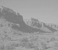
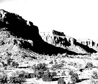
Similar values placed together are not as visually interesting as highly contrasting values, which tend to attract the eye. This means you can compose movement with value. For instance, if the values are paler and more of these grayed values are massed together they will look farther away, while strong dark and light values seem to be closer to us in the construction.


In this painting, reduced to grayscale, notice that the areas where values are almost the same create a sense of distance, while the lighter lights against the strong darks pop forward.


Middle values usually provide the framework for the painting, with light and dark value contrast giving the work its visual impact. In landscape paintings in particular, the middle values tend to be a greater proportion of the construction, with smaller areas of additional high contrast attracting the eye. When the value range is reduced the eye still goes to the area of maximum contrast, but the design loses impact. Even in a painting with low value contrast the eye will still go to the area of highest contrast -- but who cares? In other words, such a painting may become visually boring, hardly worth considering.


In this grasycale version of a painting you can see that by reducing the value contrast the eye has little or no area of interest, but in the normal contrast there is.


A wider range of tonal values will have a stronger impact. This rule is probably the most important. Creating a wide range of tones is how you construct the composition, controlling the movement of your viewer’s eye, and creating interest in the painting.

You can see that value contrast plays a large part in painting, the most important of which is moving the eye around, manipulating attention. More contrast, more interesting. Less contrast, less interesting. Value contrast is the visual impact of a painting, the oomph, the pizzazz -- or the lack thereof. If your composition lacks enough contrasting values it’s visually boring. Oddly, if your composition is consistently high in contrast all over, it’s also boring. So it isn’t about just upping the contrast to make the painting interesting. Instead you have to control the contrast to move the eye. Create your value structure with well-placed medium values, massed together, providing the underlying organization. Place stronger contrasts in key areas to attract attention, and then modulate the remaining values to induce further movement around the painting.


Morning Faces, 9x12”

Morning Faces, grayscale